How do you combine
two industry equals into
a net new brand?
How do you combine two industry equals into a net new brand?

THE OPPORTUNITY
Two leading law firms combined to create a new one, Gowling WLG. This new international firm was poised to keep up with the increasing globalization of law. The firm came to Ove in need of new branding to highlight its strength in client relationships and support its growth strategy to expand into new markets.
THE OUTCOME
Ove developed a persuasive and relevant brand strategy, brand identity, and visual identity system that helped to position the newly combined firm in the market – highlighting its focus on clients and helping it execute on the company’s growth strategy. The elements of the new brand work together for a cohesive identity and sets the new firm apart as an evolver, adapter and innovator to better serve clients’ needs.
Gowlings, a leading Canadian and international law firm, and Wragge Lawrence Graham & Co, an international law firm headquartered in the U.K., joined forces to create a new international law firm named Gowling WLG (GWLG). The resulting company is now a Global 100 law firm in 18 cities across Canada, the U.K., Europe, Asia and the Middle East/Gulf Region.
Development of a new brand positioning
Ove initiated focus groups and workshops, leader interviews and competitor audits, and reviewed third party research. The outcome of Ove’s investigative process was a resounding universal consensus that what defined both organizations – and therefore should be at the heart of the new brand – was GWLG’s ability to form close, long-term, productive, effective and even enjoyable relationships with clients and colleagues. It’s about people and relationships – the clients’ world first and foremost – that defines GWLG’s ‘product’ and drives value.
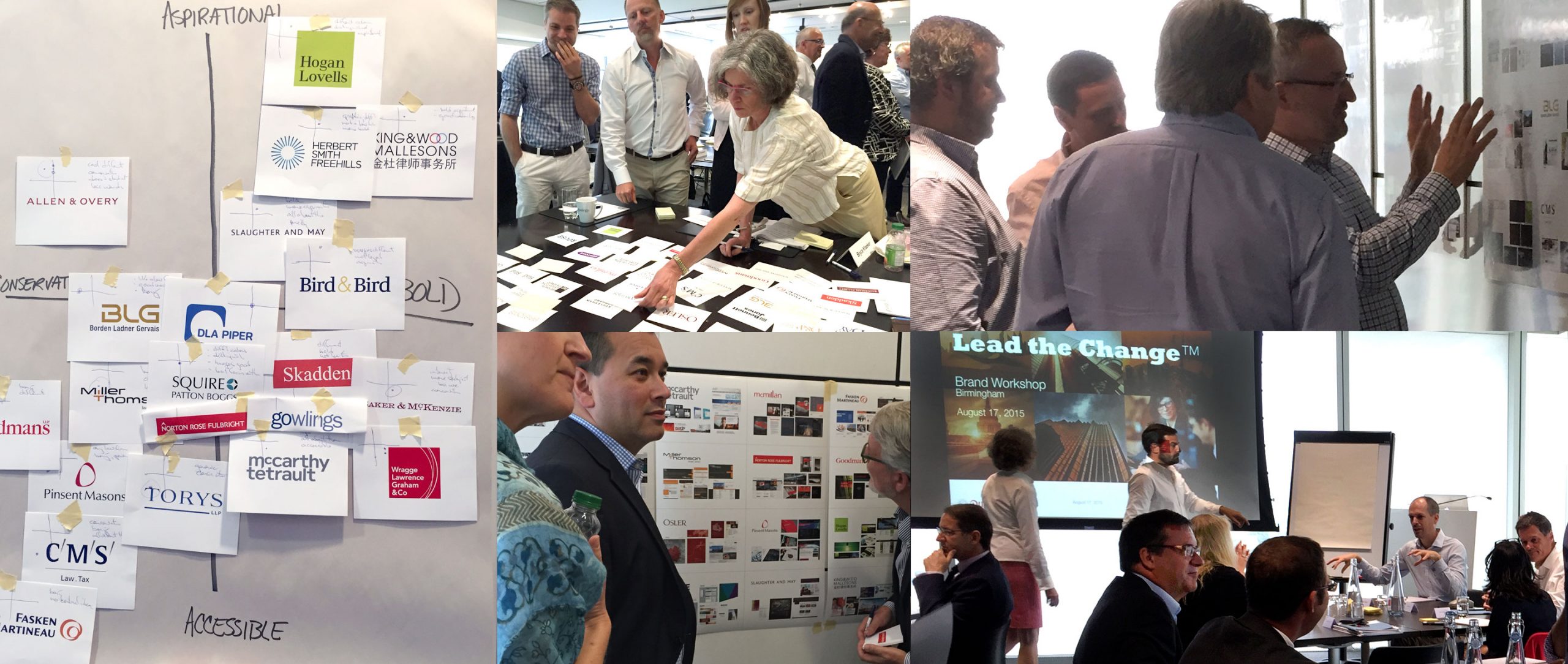

Creation of a tagline
The new brand map, positioning and architecture manifested itself through a new tagline developed by Ove, “In Tune with Your World”. The positioning connects with people, is relational and builds upon an insight that clients are looking for legal counsel that understands their business as a whole, rather than just the legal practices of their business. At a time of greater opportunity with new risks and unprecedented complexity, legal advisors must be at their clients’ side – moving at their pace and focused on the results that matter. This alignment is achieved by understanding their clients’ business and their industry – their world.
All our research pointed to the fact that this new business would, above all else, be about relationships, and the benefits that a close relationship gives you as a client.”
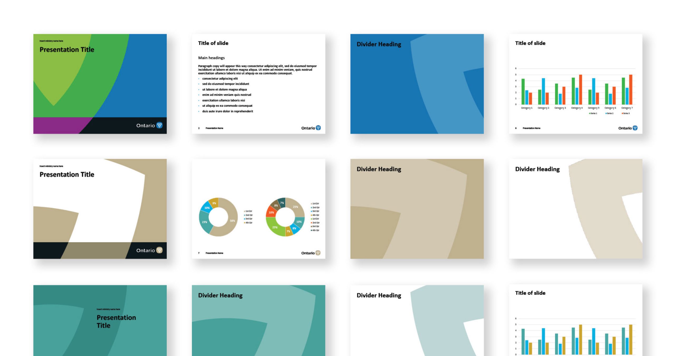
A new corporate and visual identity system
The Publicis network brought Ove, Nurun, MSL Group UK, Publicis Toronto and Publicis Montreal together in collaboration to bring the new brand to life. From the logo to content-managed global website, media relations to digital tube advertising, all assets were executed around the new communication platform with the new singled-minded proposition and a fresh and distinct look and feel.
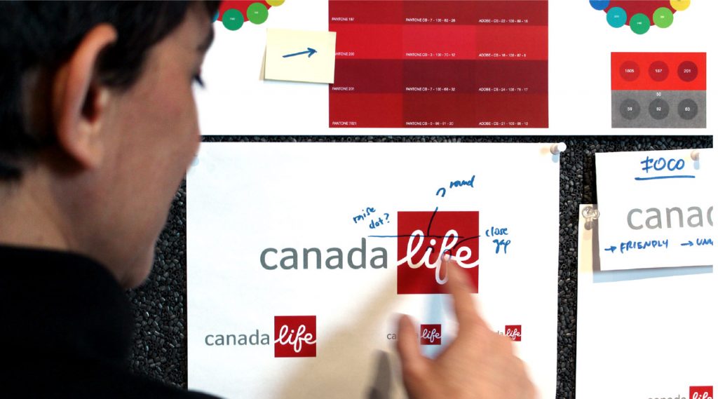
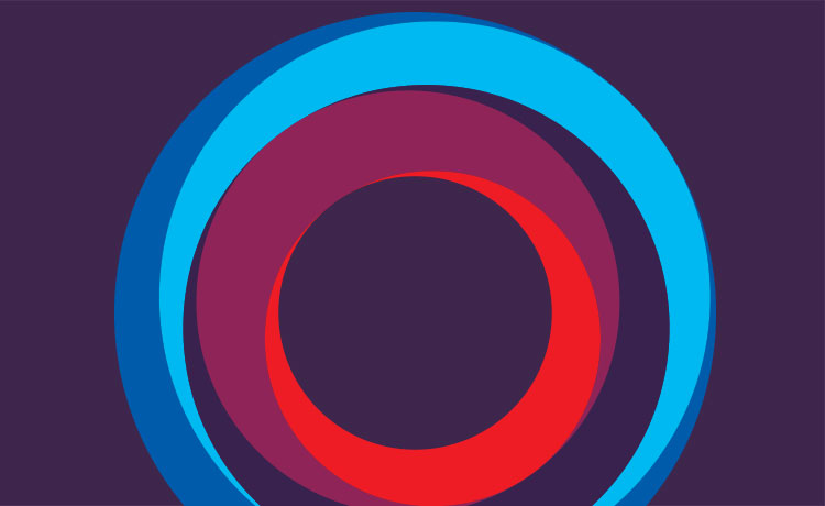
Ove’s design solution for this new combined entity was to develop a logo containing a series of concentric circles – or camera shutters – to depict the idea of focus, a ‘lens’ that brings the world of GWLG’s clients into focus, helping to highlight what matters most, the symbolic relationship GWLG has with their clients.


This iconic shape became the heart of the visual identity system and overlaid images and colour planes to signify GWLG’s focus to serve its clients by being in tune with their world and ambitious for their success. Since the brand launch, Ove continues to support Gowling WLG on various communications and strategic brand-focused initiatives.
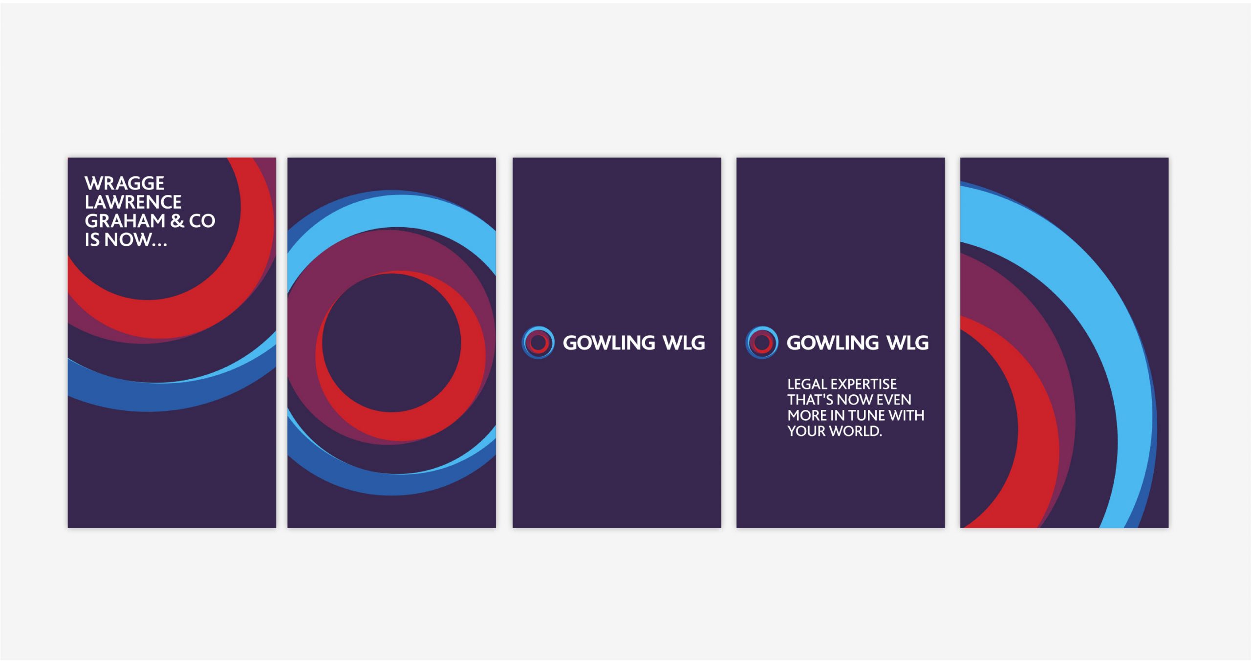
Announcement ad

Website design
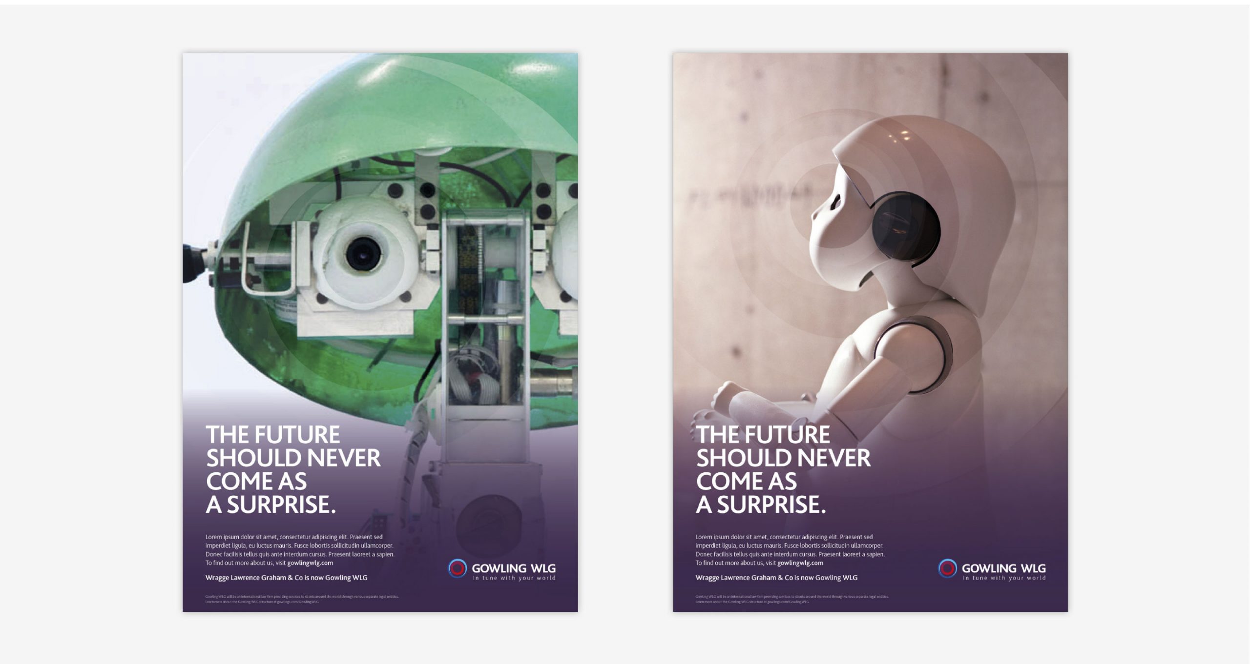
Ad campaign
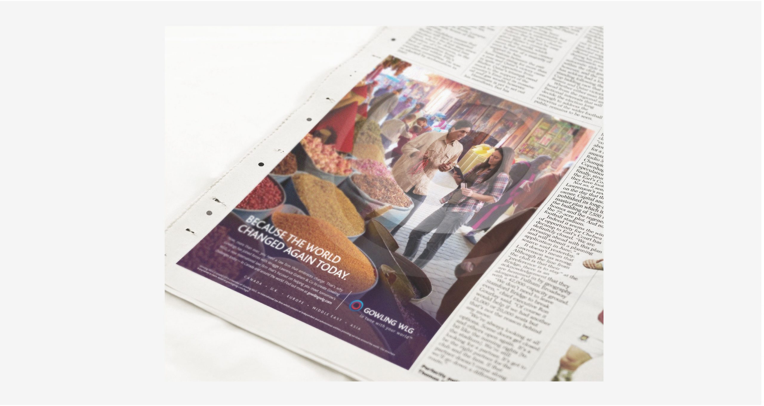
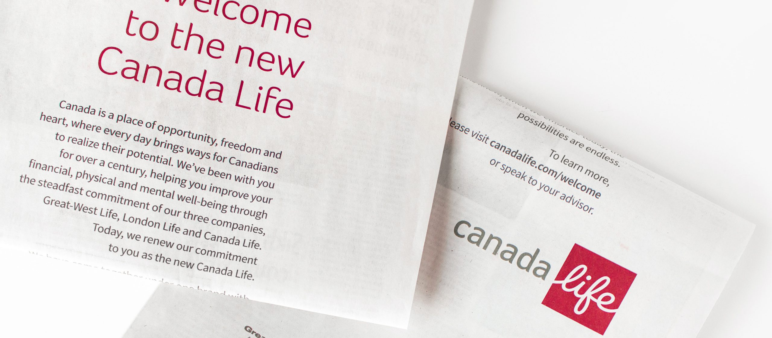
Newspaper ad
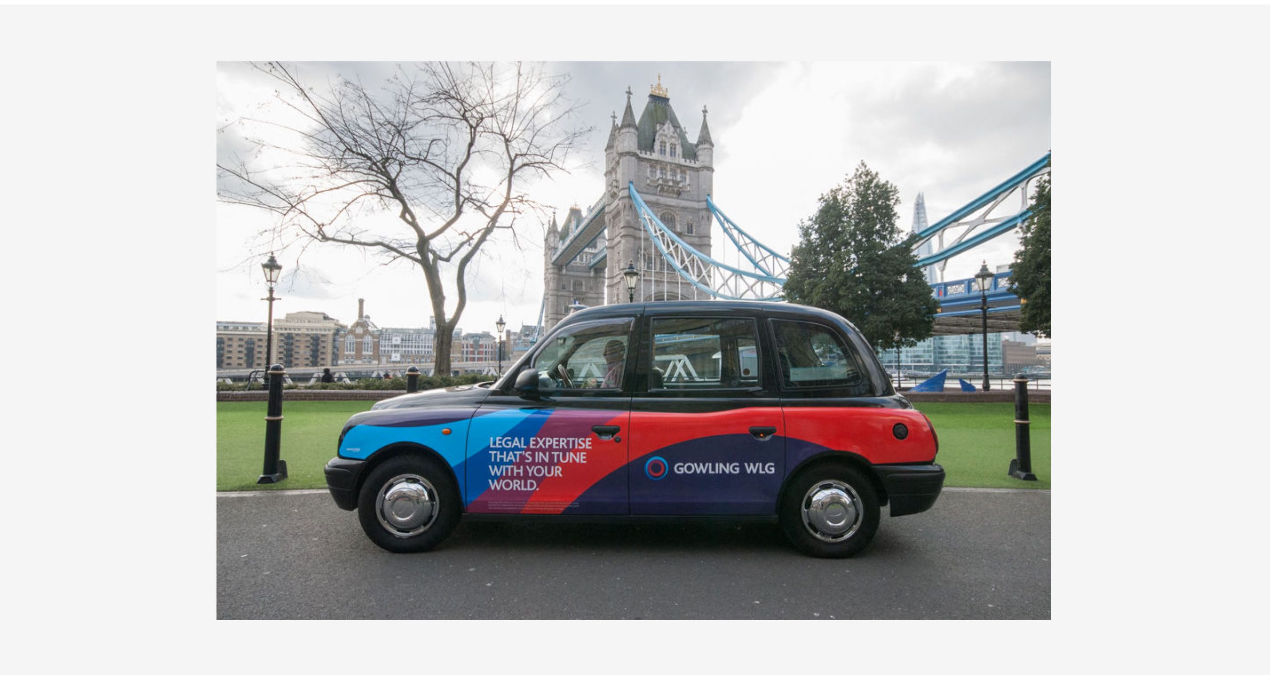
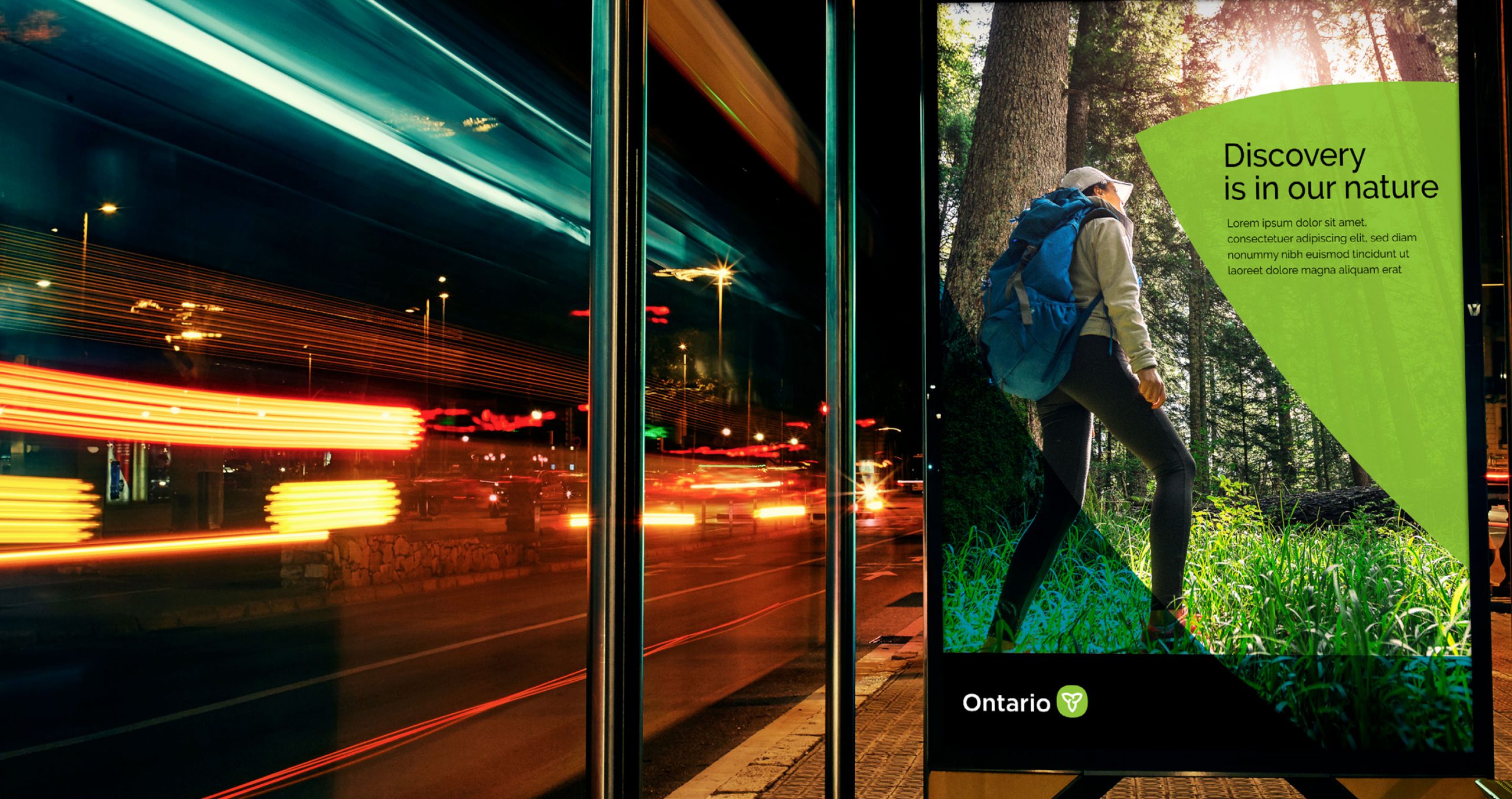
Taxi advertising with Ubiquitous London

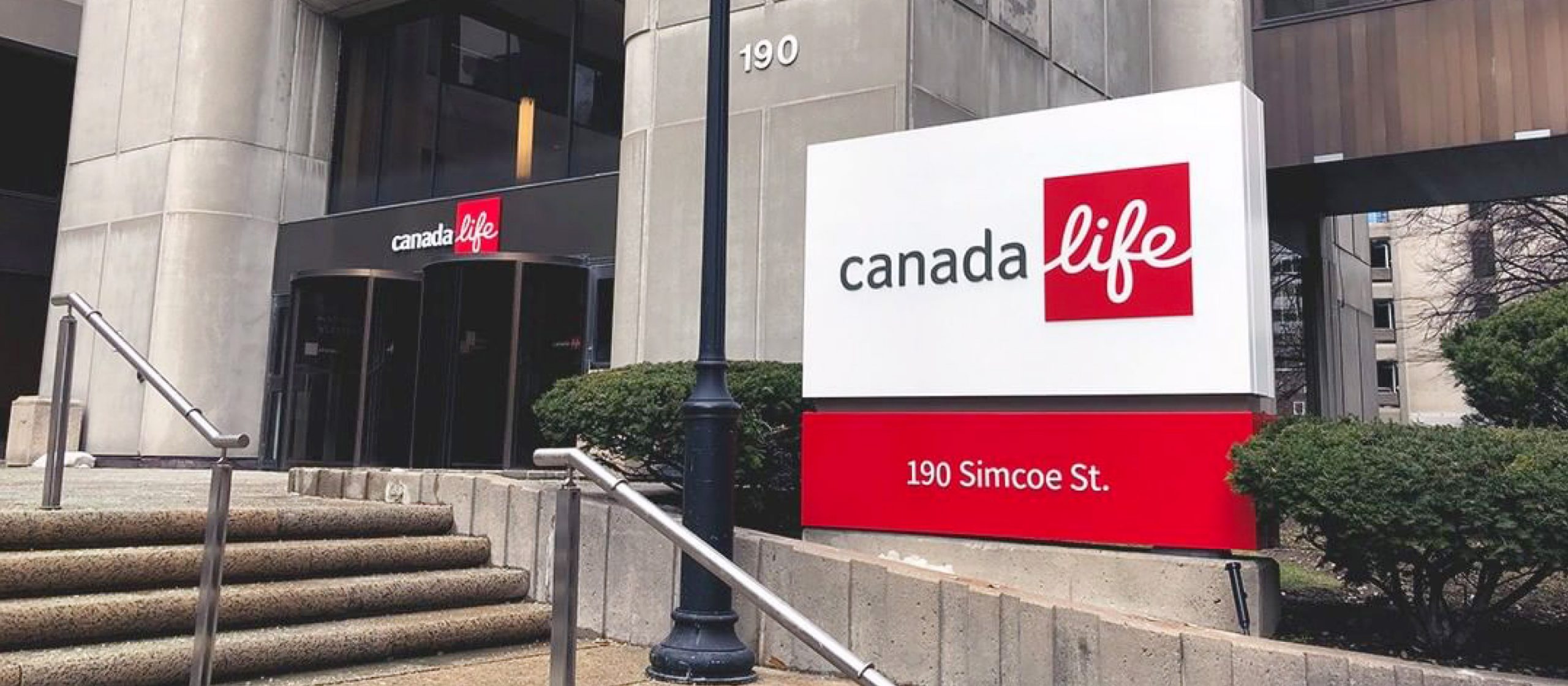
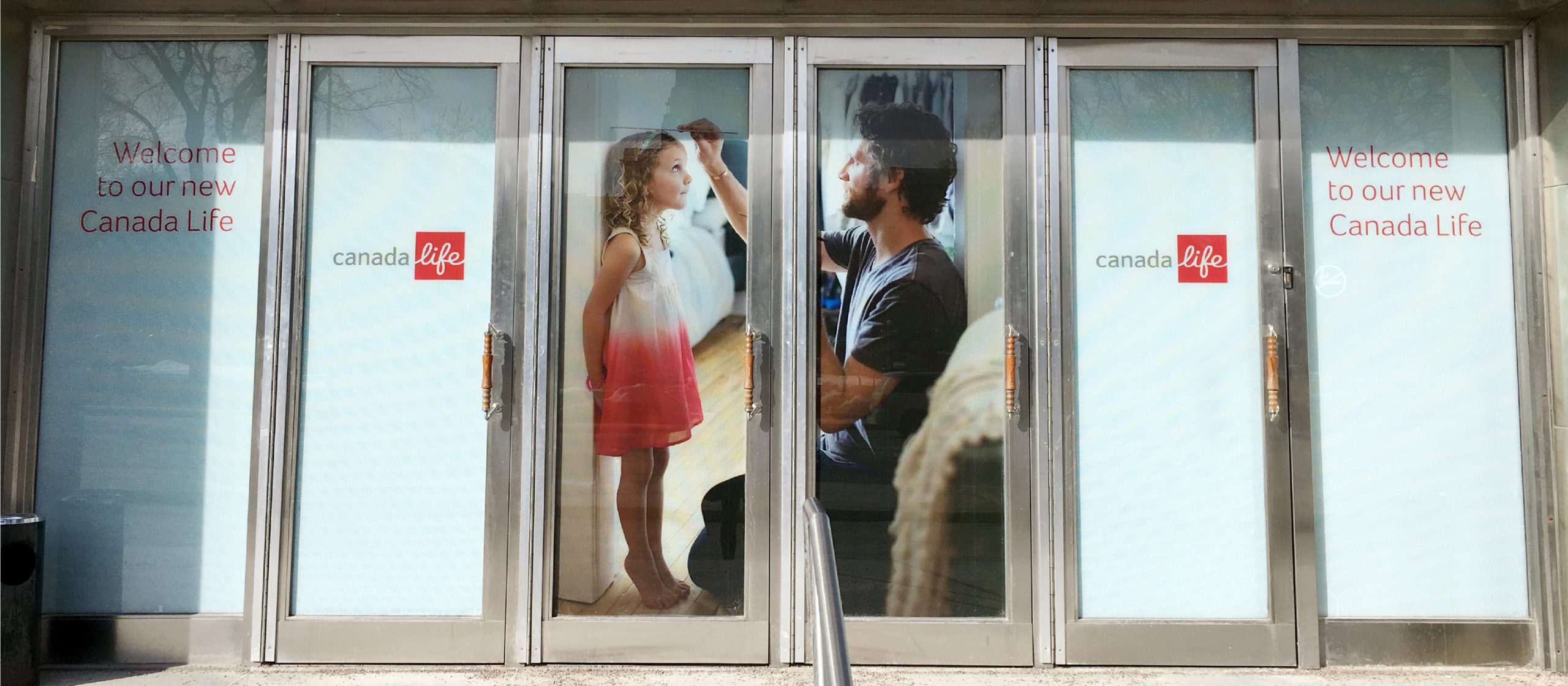
Exterior environmental signage
Our contribution
- Research and insights
- Brand strategy and positioning
- Brand architecture strategy
- Communications and messaging strategy
- Naming and nomenclature systems
- Brand identity and system design
- Marketing and advertising communications
- Corporate and employee communications
- Visual identity guidelines
- Brand launch planning and implementation
- Website design and development
- Signage and environmental