Can brand be the answer to
delivering efficiencies?

Can brand be the answer to delivering efficiencies?
THE OPPORTUNITY
Shift perceptions: Many associate government interactions with bureaucracy and complexity.
Simplify: Multiple brands cause wasteful spending and fragmentation. Simplify into one holistic identity.
Build recognition: Citizens don’t recognize the extent of services offered by the Ontario government. Broaden awareness.

THE OUTCOME
An expressive, memorable tagline, “Working for you”, articulates the Ontario government’s commitment to its stakeholders. An ownable toolkit of visual elements creates brand recognition for all government services and reduces implementation costs. The deinstitutionalization of the brand expression fosters a people-centric, dynamic image that Ontarians can connect with and be proud of.
Turning a fragmented brand into a powerhouse of brand recognition and mass appeal
From issuing a driver’s license to helping Ontarians support fresh local produce, the Government of Ontario provides hundreds of vital services, many of which go unnoticed. Over the years, an abundance of distinct logos and brands had been developed for Ontario Government Ministries, Agencies and Crown Corporations. What was lacking was a central brand strategy. This resulted in a fragmented brand for Ontario that was confusing to the public.
The brand project coincided with a transformation initiative for the approximately 60,000 employees of the Ontario Public Service (OPS). This included a new vision to be a leading public service that was inclusive, innovative, responsive and accountable. The new brand had to support this transformation by inspiring employees and attracting new talent and, above all, galvanizing employees under one brand.


Since 2011, the ministries and agencies of the Ontario government wasted more than $2 million on visual identity work that only served to fragment the Ontario government’s brand and confuse the public about what it stands for. Existing visual identifiers will be retired and replaced by variations of a flexible and adaptable brand system based on the new Trillium.”
2019 Ontario budget
Working to shift public perception
Working with our partner brand strategists, LEVEL5, we conducted focus groups with the general public and interviews with elected and non-elected government stakeholders. Based on the research, the new brand needed to shift public perception of the government from being confusing and bureaucratic to being simple and easy, transparent and relevant for today.
The insights led to a new brand promise for Ontario and a new unifying tagline: “Working for you”. This statement united government services by a shared recognition that they are responsible for providing the people of Ontario with a better government experience that is focused on citizens’ needs.


Mining equity from the original Trillium
Drawing from the original 1964 Trillium logo for inspiration, the new version of the logo reconnects us to Ontario’s heritage while refinements ensure the logo meets the demands of an evolving digital world. This refreshed logo also sits harmoniously with legacy applications, implements the new brand in a measured manner and minimizes the financial impact of brand conversion.


A flexible logo to celebrate Ontario’s diversity
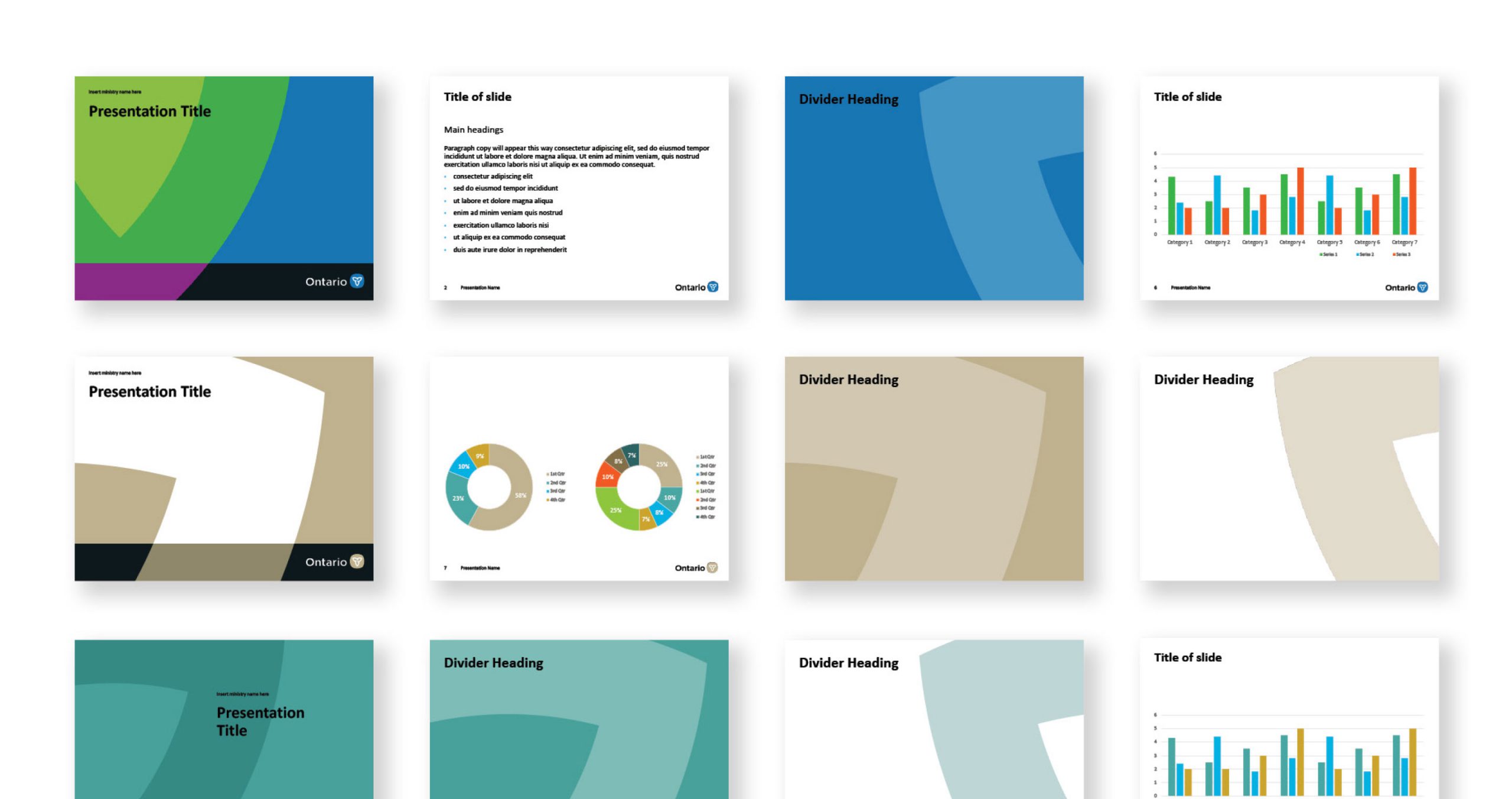
Deinstitutionalizing the brand in favour of one that is people-centric, the logo was designed in 13 colours. These logos can be used interchangeably, creating flexibility in the system for employees to choose a colour that best suits their communication objectives.


The creation of a new super graphic and brand architecture
A series of close-cropped angles of the Trillium became a key component of the design system and intrinsically linked the system to the new logo.
A new brand architecture was also developed to ensure ministries and agencies visually link back to the Ontario government, eliminating confusion surrounding the many different logo styles currently in use.


Our contribution
- Research and insights
- Brand strategy and positioning
- Brand architecture strategy
- Communications and messaging strategy
- Brand identity and system design
- Visual identity guidelines
- Brand training


