Can an airport
bring you the world?
Can an airport
bring you the world?
THE OPPORTUNITY
The operating model of the Greater Toronto Airport Authority (GTAA) was evolving. The brand needed to shift from a mindset of “moving people and things” to the vision of a new airport experience known as Toronto Pearson. To support this transition, a new identity was needed, one that reflected Toronto
Pearsonʼs position as North America’s
premier gateway to a world of possibilities.
THE OUTCOME
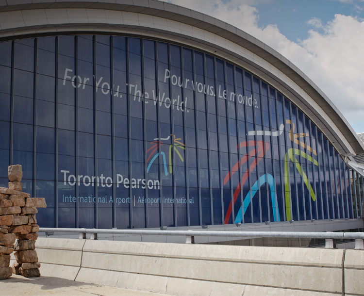
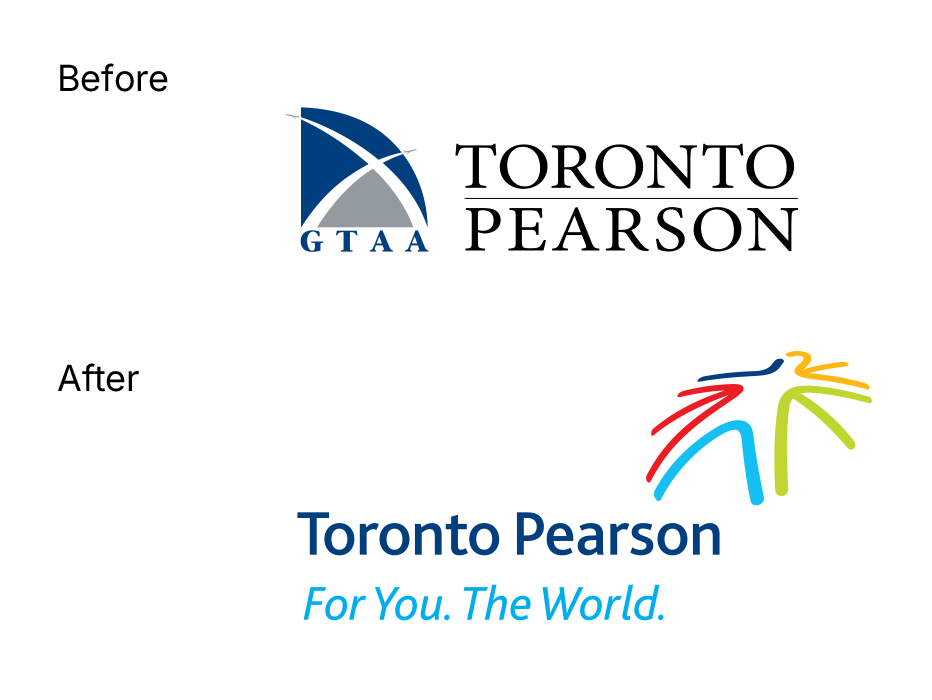
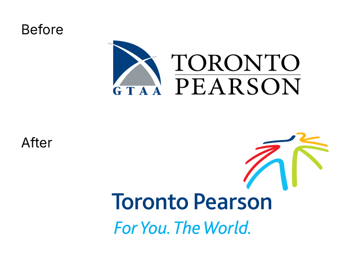
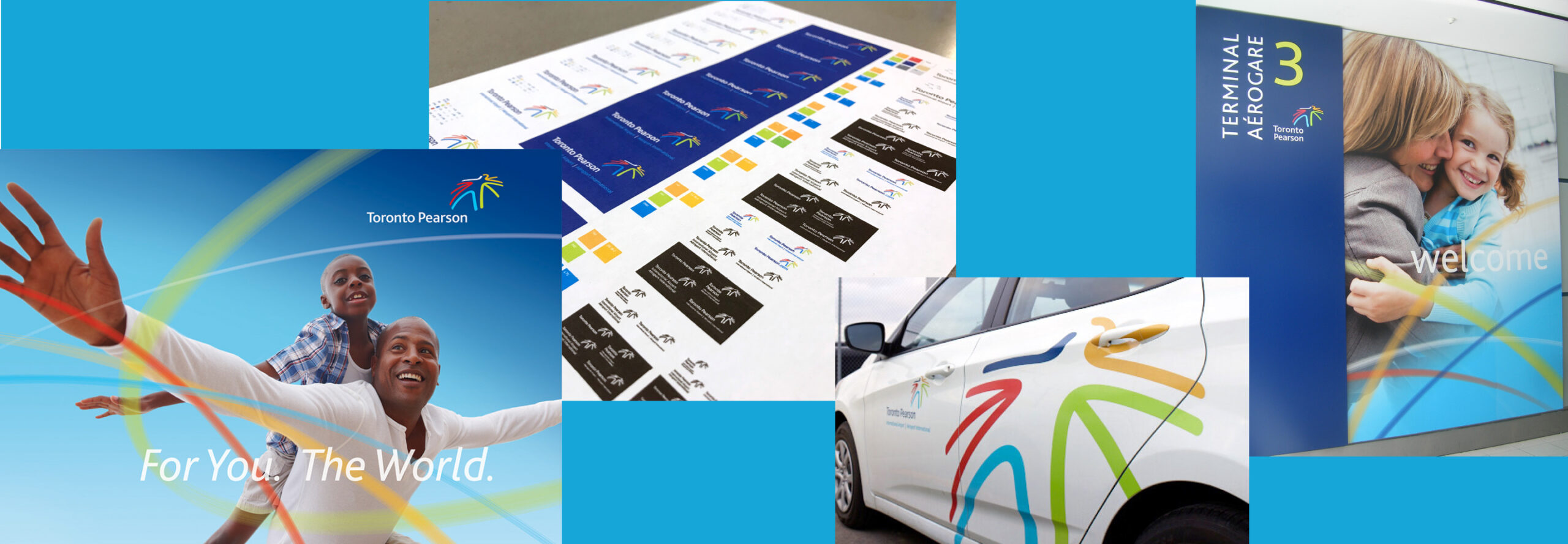
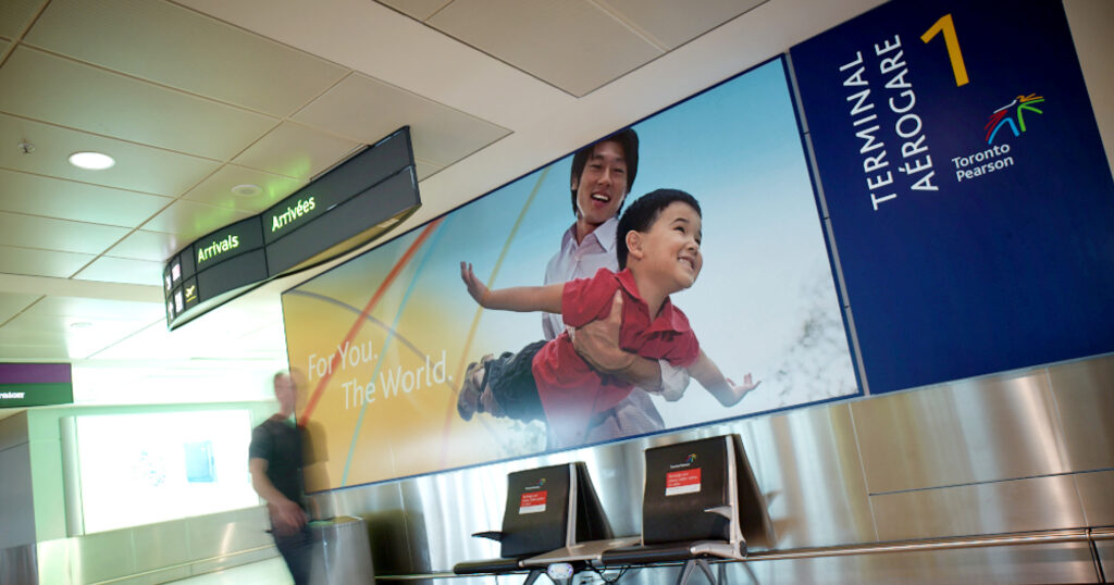
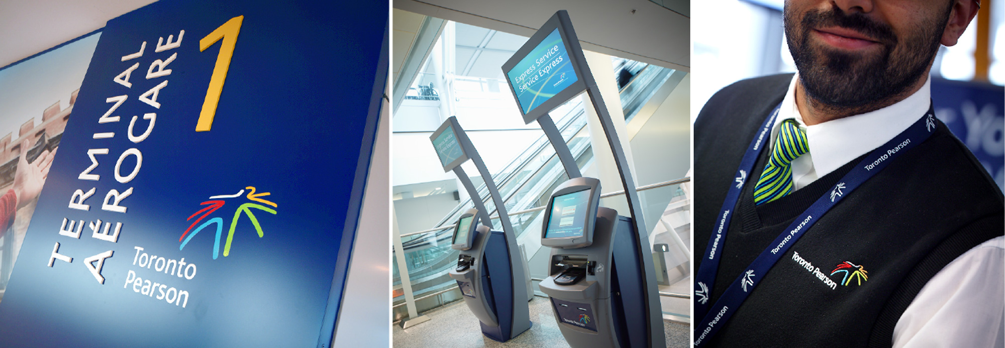
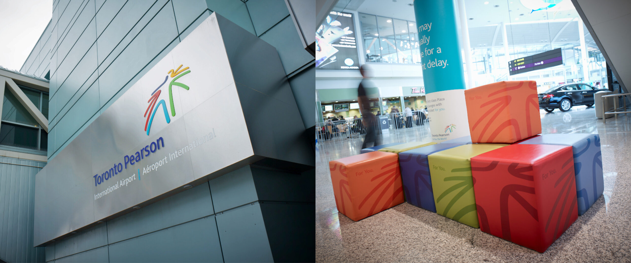
A reimagined brand identity featuring a dynamic human icon launched the GTAA on its quest to make Toronto Pearson North Americaʼs top international travel hub, appealing to travellers and airlines alike. An engaging new visual style celebrating people and possibilities inspired a website update and expansive signage system in airport terminals.
The spirit of the identity
Ove designed a new brand identity to capture the true spirit of travel. Its colourful and dynamic form represents the trajectory of planes in the sky, the connecting of people and places, and the coming together of airport services.
The voice of the brand
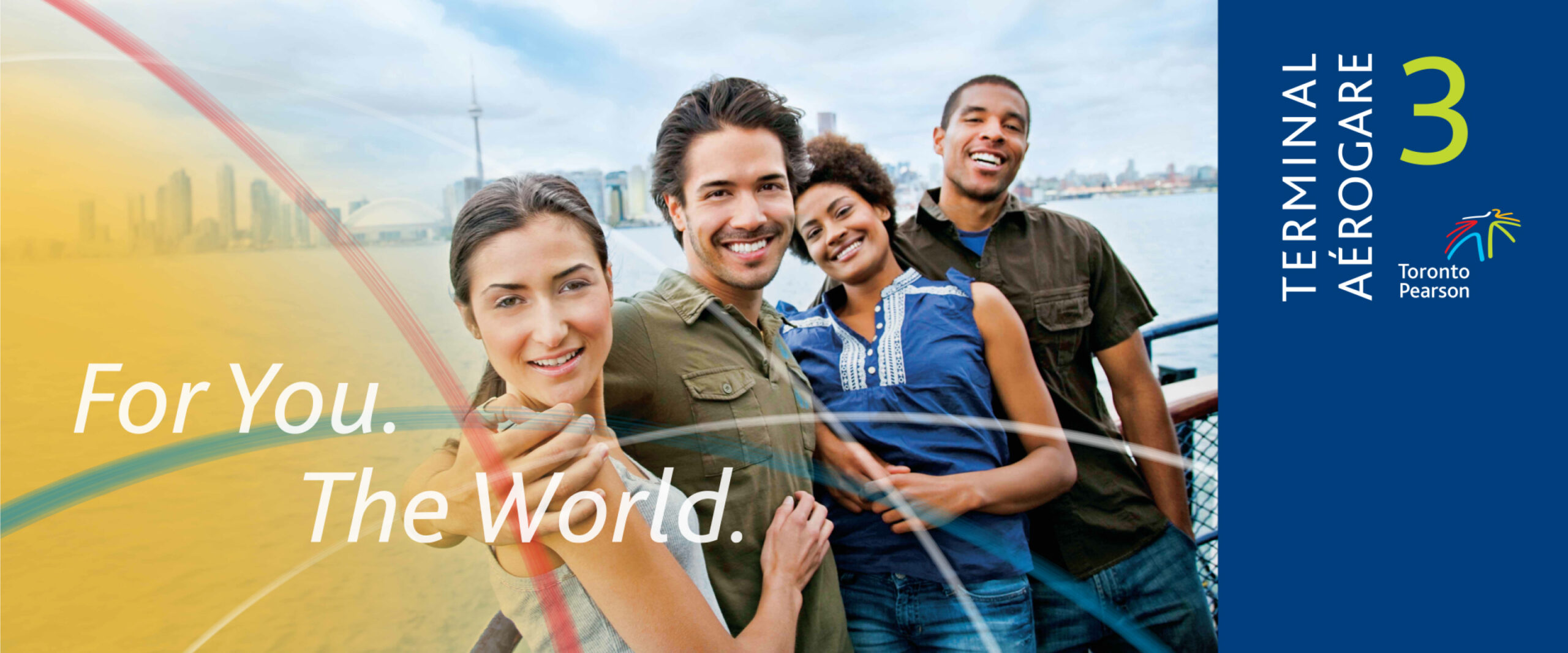
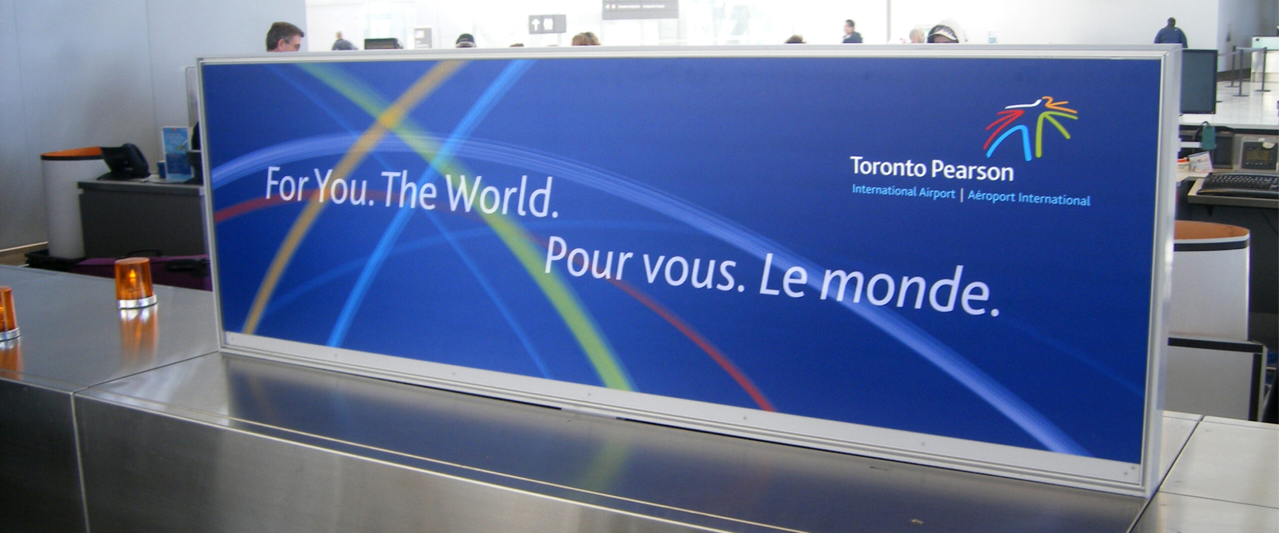
Ove developed the tagline, “For You. The World.” (“Pour vous. Le monde.”), to serve as the foundation for a series of tactical communications. Paired with the new identity system, it helped Toronto Pearson reposition airline travel in Canada as a more human experience, encouraging both customers and airlines to feel like guests.
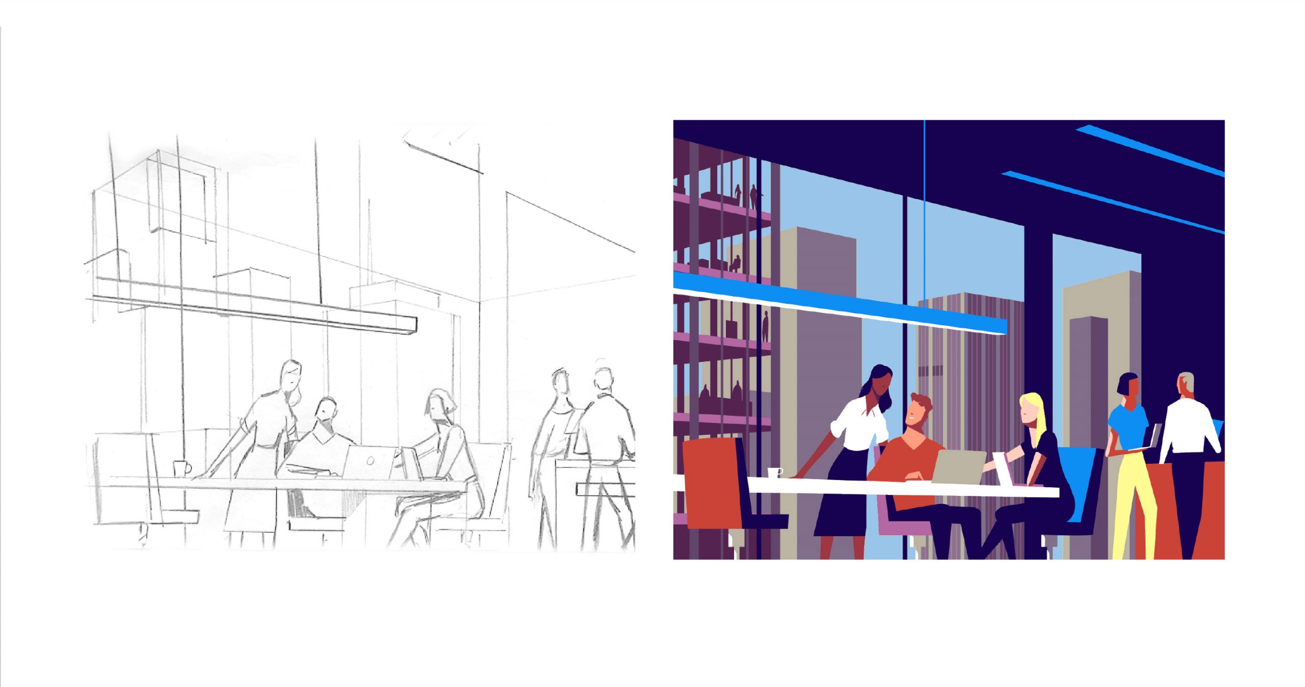
The emotion behind every experience
Beyond depicting specific travel scenarios, imagery was selected to convey a range of feelings associated with great travel experiences:
- A feeling of excitement
- A chance to relax
- A sense of togetherness
- The hope of adventure
- A sense of connection to the world
We must be more than an airport, and become
From the Toronto Pearson brand story.
a portal forging smart connections. An
innovative and responsive conductor to a great
ensemble of people, products and services,
orchestrating choice and access, smoothly
and seamlessly. Those whom we once call
passengers, we will now call guests.ˮ
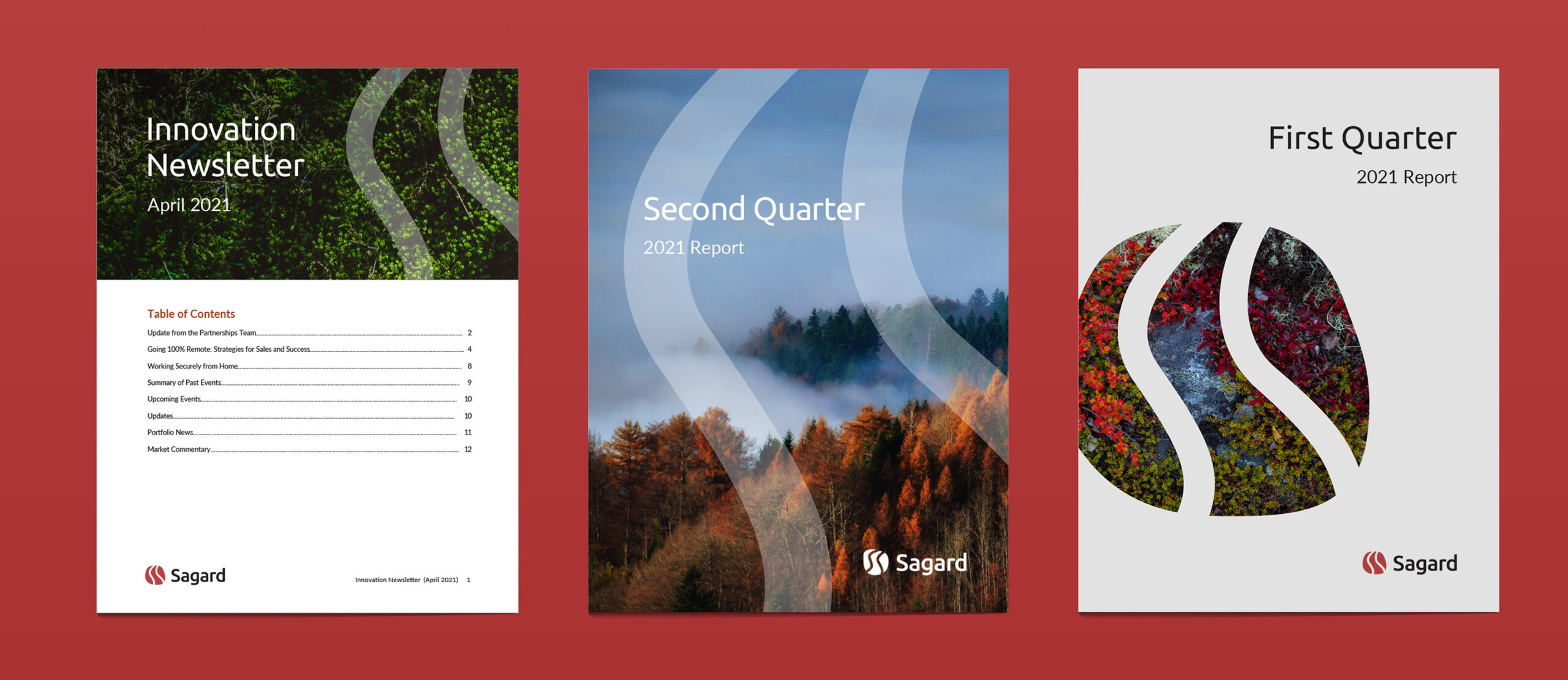
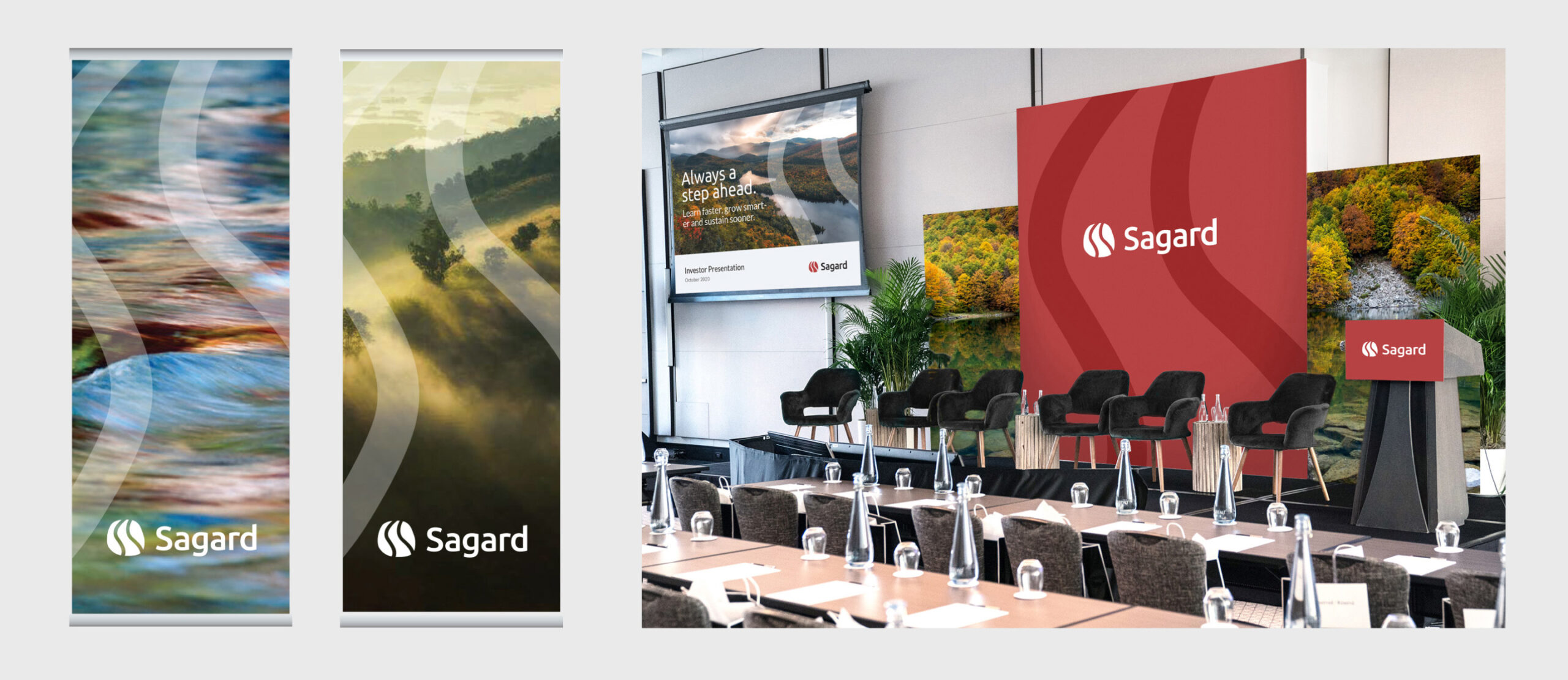
Bringing the world to you and you to the world
From train wraps, signage and banners to wheelchairs, name badges and apparel, to in-terminal
communications and advertising and web design, the Toronto Pearson visual style infuses the energy of the logo and the airport’s personality into every element.
Enhancing the graphic toolbox to create ownable imagery
The logo serves as the inspiration for all other elements in the program – in particular, fonts, colours, and the connecting arcs graphic. This broader visual toolkit gives Toronto Pearson the flexibility to ensure consistency in their messaging, while telling the brand story with a greater range of expression than the logo alone would accomplish.
Together, these elements help to shift perceptions of GTAA from being a large-scale airport operator to a friendly service provider, welcoming passengers as guests from all around the globe. This rebranding positions Toronto Pearson as a must-visit destination, promising to attract and serve customers by offering value through innovation, products, and services.
Exhibition program
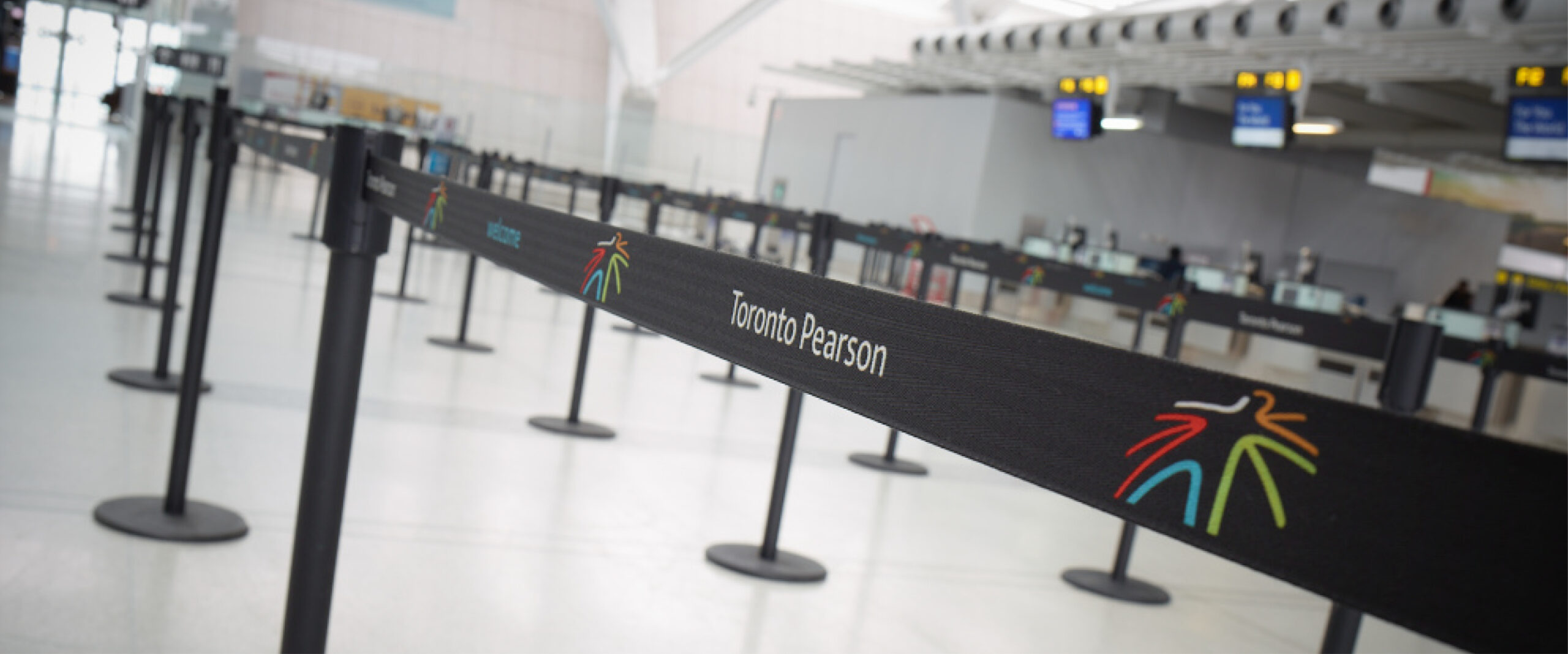
Stanchions
Signage
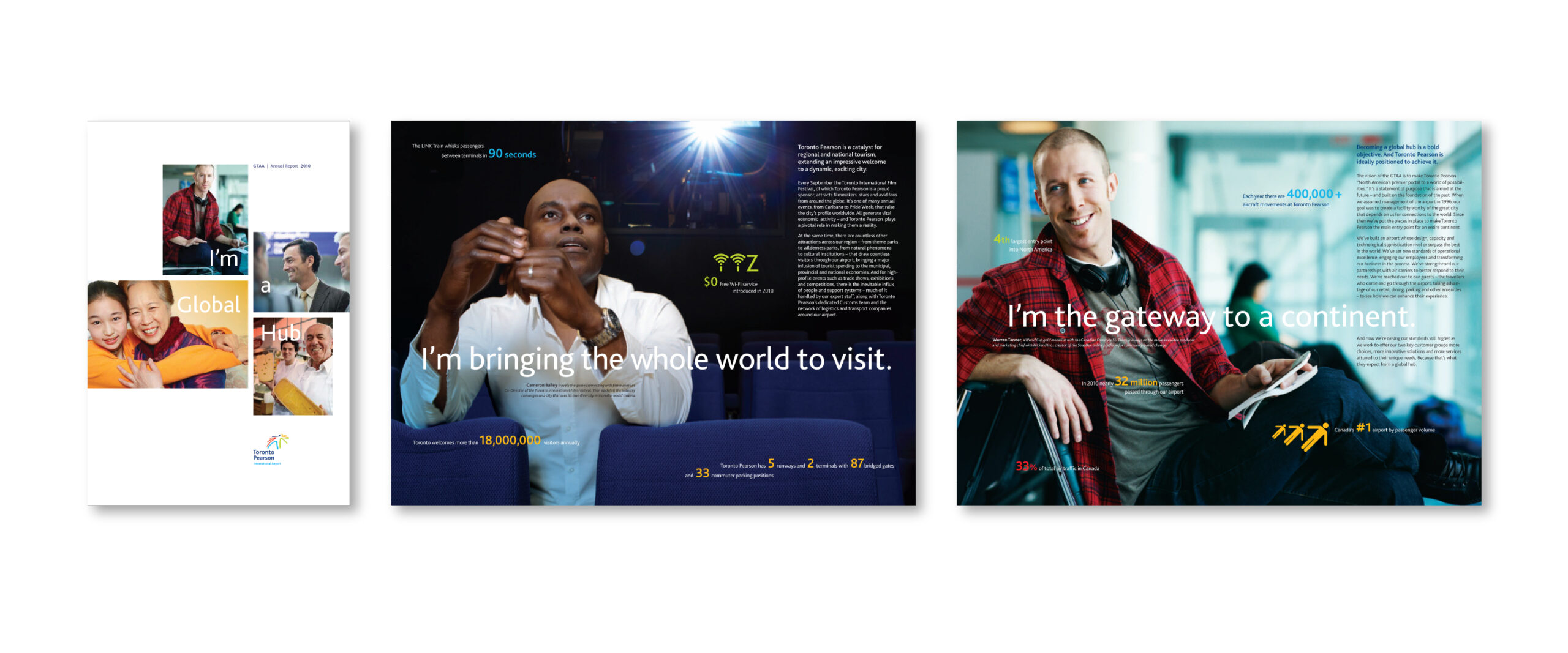
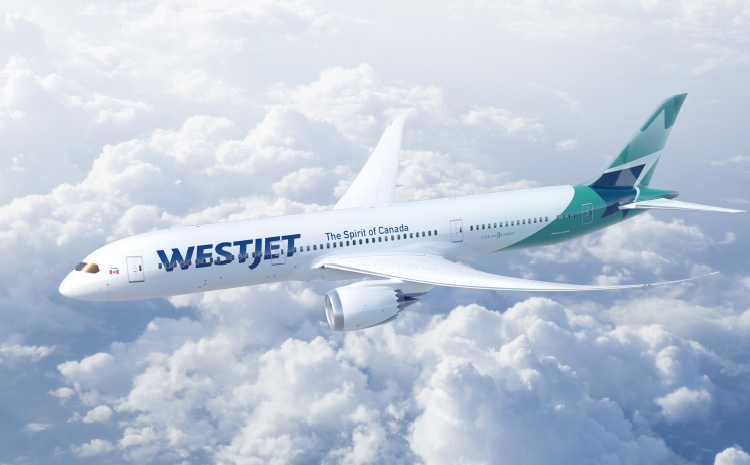
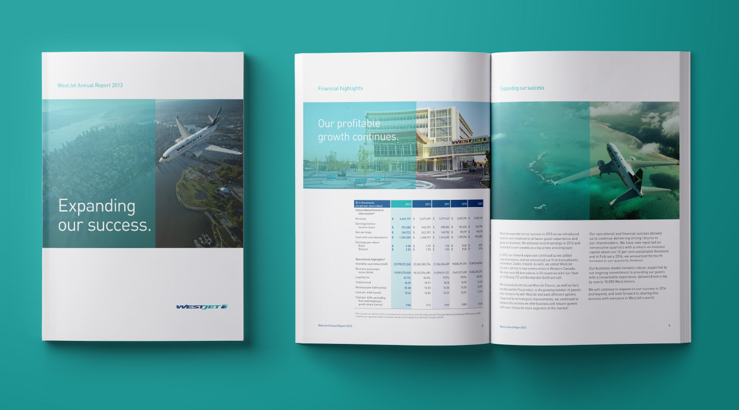
Annual report
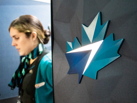
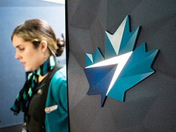
Signage
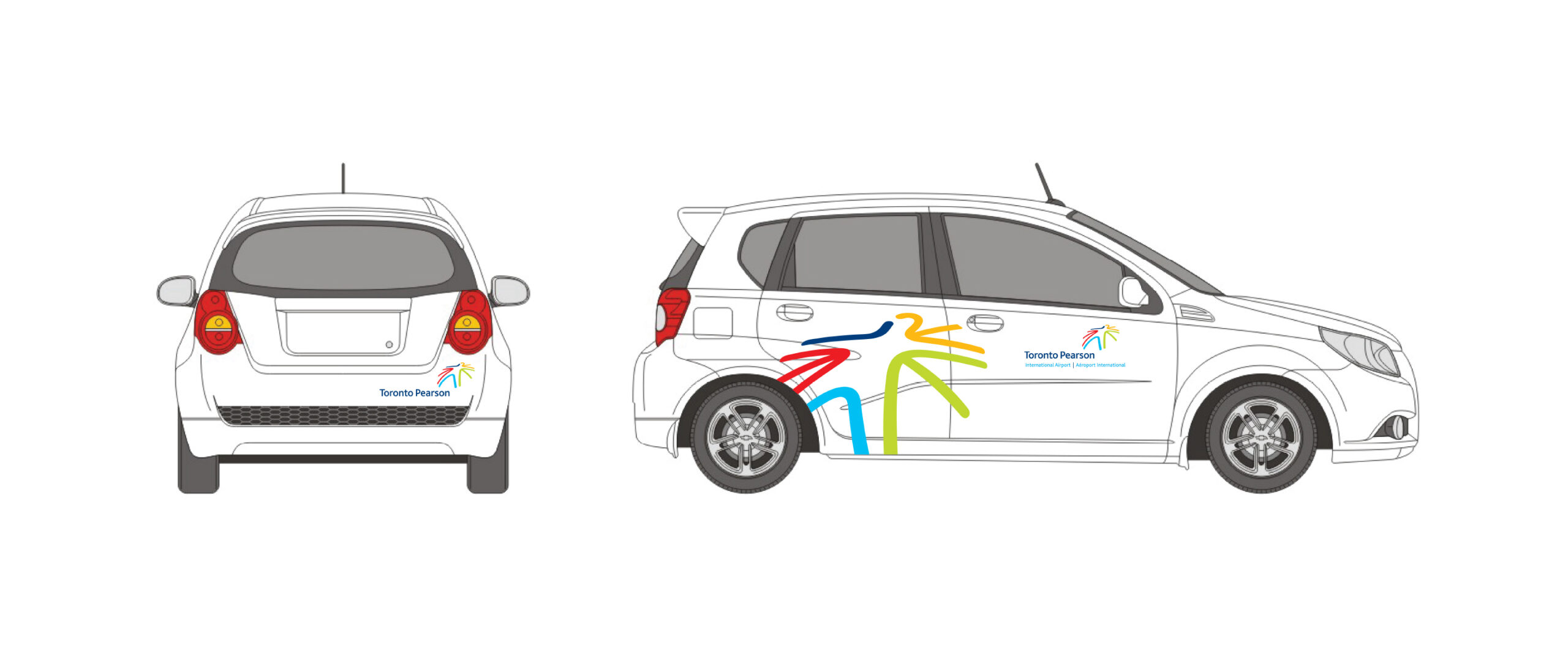
Vehicle wraps
Our contribution
- Brand strategy and positioning
- Brand identity
- Marketing and advertising communications
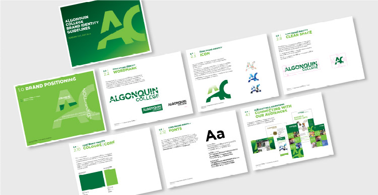
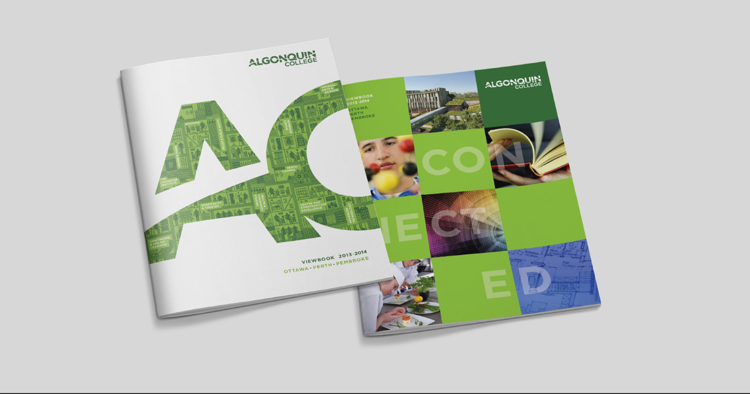
- Visual identity system and guidelines