Can a company build on
the past while sharing a new
vision for the future?
FIRST CAPITAL REIT

Can a company build on the past while sharing a new vision for the future?
FIRST CAPITAL REIT

THE OPPORTUNITY
First Capital had evolved, building on a solid 20-year reputation as a well-run developer of retail properties into a developer of innovative, super-urban neighbourhoods. As part of its transition to a REIT, First Capital reached out to Ove as it wanted to signal change, while making sure that its true value and strategic focus was clear.

THE OUTCOME
The creation of a new strategic platform brought First Capital’s vision and value to life. A new tagline, brand story and visual identity sets the REIT apart from its peers and positions it for future growth as the leader in super-urban, mixed-use real estate.

Building from the Ground Up
Capturing a new brand purpose
After conducting a competitive analysis and interviewing a number of stakeholders, Ove went through a creative process to capture the essence of the renewed business focus and super-urban strategy. This exploration played a key role in the development of a new corporate brand platform, which led to the creation of a communications platform and a new corporate identity.
First Capital’s new brand reflects our commitment to leadership in developing sustainable, vibrant neighbourhoods. We are dedicated to providing one of the most progressive and diverse working environments in Canada and our brand must convey and express that positioning.”
Michele Walkau, First Capital’s Senior Vice President, Brand and Culture
Changing perceptions through communication
We created a new tagline, “Creating thriving urban neighbourhoods” to signal the company’s shift beyond retail into building mixed-use communities of the future. It’s not just about transforming spaces, but creating vibrant places that are at the centre of people’s daily lives.
Conveying who they are and where they’re growing
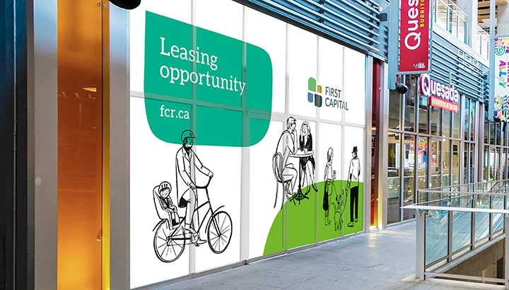
We developed a new brand identity for First Capital – one that helped it stand apart from its competitors while capturing the spirit of innovation, community and Real Estate development.
The new logo, a stylized city intersection, was inspired by both the cobblestones found in human-scaled communities and speech bubbles. The design is unique and distinctive in the Real Estate Sector. The colour scheme strikes a balance between the need to position the company for REIT investors while reflecting the community focus of the company. The four organic shapes that make up the logo also act as “supergraphic” elements that are used on marketing materials.


Our contribution
- Research and insights
- Brand strategy and positioning
- Naming and nomenclature systems
- Brand identity design
- Signage and environmental


