Can a company build on the past while sharing a new vision for the future?
FIRST CAPITAL REIT
Can a company build on the past while sharing a new vision for the future?
FIRST CAPITAL REIT
THE OPPORTUNITY
First Capital had evolved, building on a solid 20-year reputation as a well-run developer of retail properties into a developer of innovative, super-urban neighbourhoods. As part of its transition to a REIT, First Capital reached out to Ove as it wanted to signal change, while making sure that its true value and strategic focus was clear.
THE OUTCOME
The creation of a new strategic platform brought First Capital’s vision and value to life. A new tagline, brand story and visual identity sets the REIT apart from its peers and positions it for future growth as the leader in super-urban, mixed-use real estate.
Building from the Ground Up
Capturing a new brand purpose
After conducting a competitive analysis and interviewing a number of stakeholders, Ove went through a creative process to capture the essence of the renewed business focus and super-urban strategy. This exploration played a key role in the development of a new corporate brand platform, which led to the creation of a communications platform and a new corporate identity.
First Capital’s new brand reflects our commitment to leadership in developing sustainable, vibrant neighbourhoods. We are dedicated to providing one of the most progressive and diverse working environments in Canada and our brand must convey and express that positioning.”
Michele Walkau, First Capital’s Senior Vice President, Brand and Culture
Changing perceptions through communication
We created a new tagline, “Creating thriving urban neighbourhoods” to signal the company’s shift beyond retail into building mixed-use communities of the future. It’s not just about transforming spaces, but creating vibrant places that are at the centre of people’s daily lives.
Conveying who they are and where they’re growing
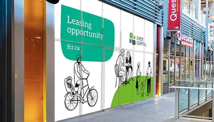
We developed a new brand identity for First Capital – one that helped it stand apart from its competitors while capturing the spirit of innovation, community and Real Estate development.
The new logo, a stylized city intersection, was inspired by both the cobblestones found in human-scaled communities and speech bubbles. The design is unique and distinctive in the Real Estate Sector. The colour scheme strikes a balance between the need to position the company for REIT investors while reflecting the community focus of the company. The four organic shapes that make up the logo also act as “supergraphic” elements that are used on marketing materials.
Our contribution to First Capital REIT’s transformation
Research and insights
Brand strategy and positioning
Naming and nomenclature systems
Brand identity design
Signage and environmental
What happens when a partnership flourishes?
What happens when a partnership flourishes?
BMO
THE OPPORTUNITY
BMO has grown from its inception as Canada’s first bank to become North America’s eighth-largest bank. This remarkable evolution has always been driven by a clarity of vision that connects its businesses and its audiences. The power of BMO’s vision comes not only from the strategy that underlies it, but from its consistent, compelling, and effective communication.
THE OUTCOME
For more than 35 years, BMO has partnered with Ove to create communications that demonstrate the bank’s relevance, value, and evolving vision – creatively, consistently, and powerfully to its many stakeholders. Bridging strategies and projects, businesses and geographies, Ove has collaborated with teams across the bank to help ensure the BMO brand is nurtured and strengthened.
Built for growth
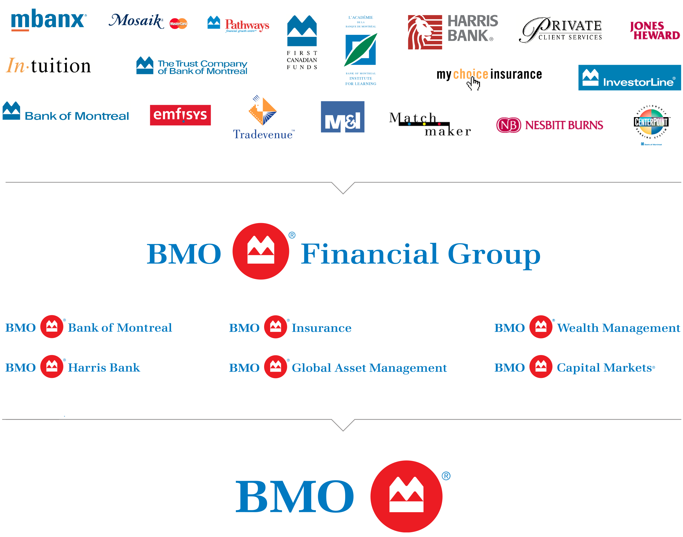
BMO’s evolution from Canadian bank to a North American financial services powerhouse with global reach demanded a brand system that would support evolving banking, wealth management, and capital markets businesses as it pursued new opportunities and markets. Ove developed BMO Financial Group as a strategic, structured brand system to serve as the platform for growth.
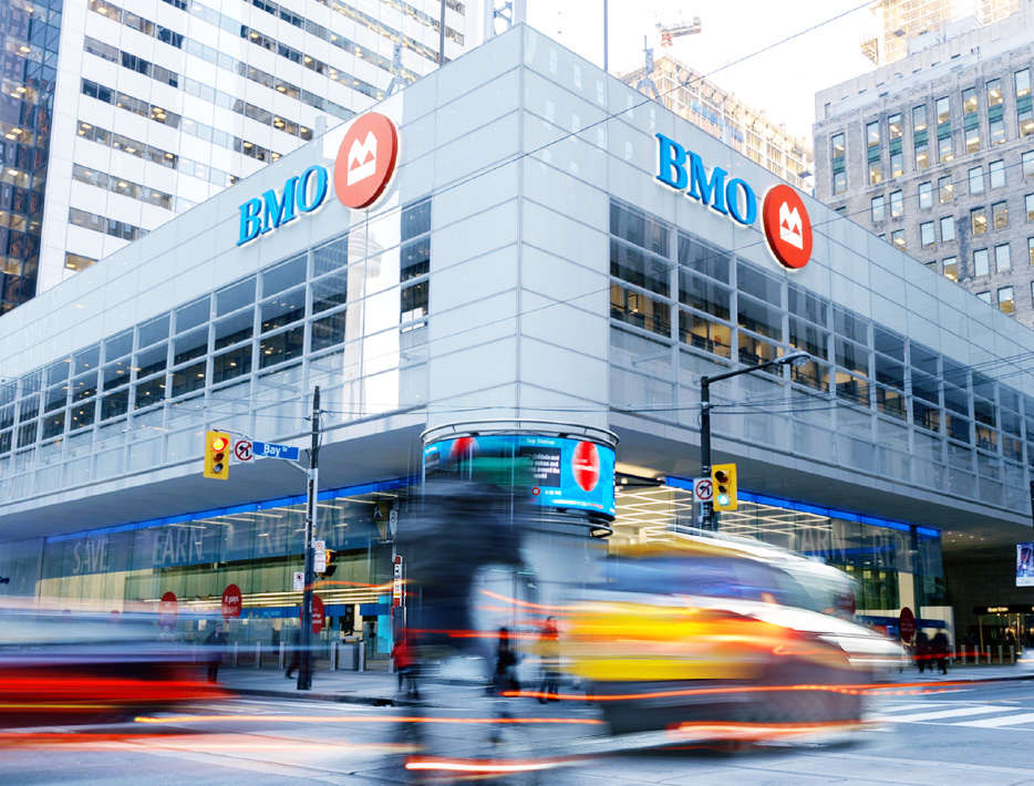
Leveraging the strength of the iconic Bank of Montreal logo, the BMO roundel was introduced in 2002. At that time, BMO was operating more than 30 lines of business, including Harris Bank and Nesbitt Burns. The move to a shared identity signaled a renewed commitment to serving customers as a single, diversified North American bank. The identity system continues to evolve to underscore BMO’s ‘one bank’ approach to serving its customers and supporting communities.
Telling the next chapter in the BMO story
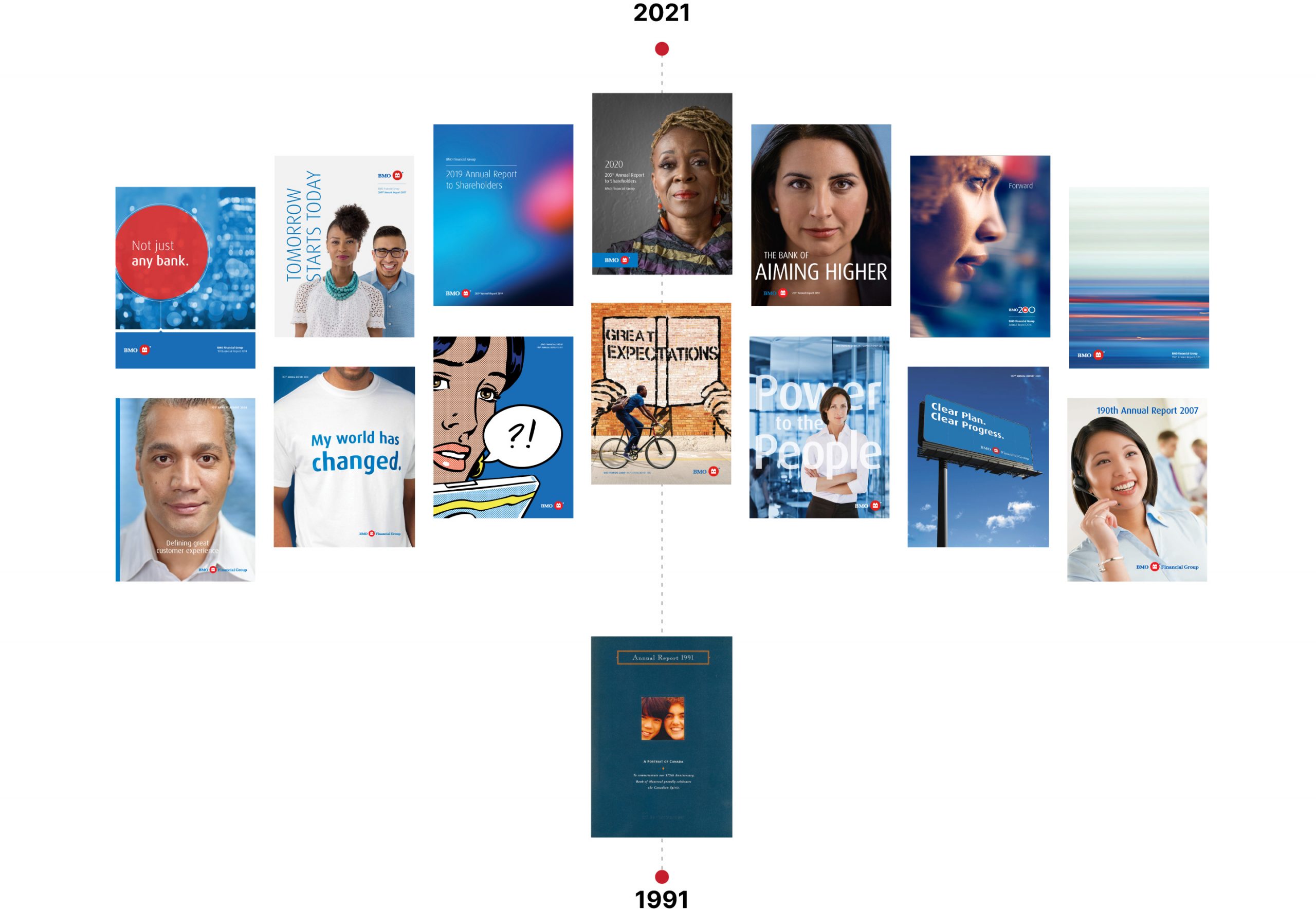
Since 1991 – through BMO’s evolution and the evolution of corporate reporting – Ove has created award-winning annual reports for the bank. These reports tell the story of BMO’s continued relevance in the marketplace, and its perspective on broader shifts in technology, society and the economy. While annual reports are by their very nature reflective, they capture a moment in time and provide an opportunity to look to the future. BMO’s annual reports tell the story of the bank’s journey and its indelible, positive impact on the financial lives of its customers and the wellbeing of their communities.
Celebrating past, present and future
Along every journey there are milestones, and Ove has been there to help BMO commemorate some of its most important moments. They are moments to reflect and reaffirm purpose and acknowledge the progress that has been made, while firmly focusing on the future and opportunities ahead.
BMO 200 logo
A Vision Greater than Themselves, By Laurence B. Mussio – Lenticular cover
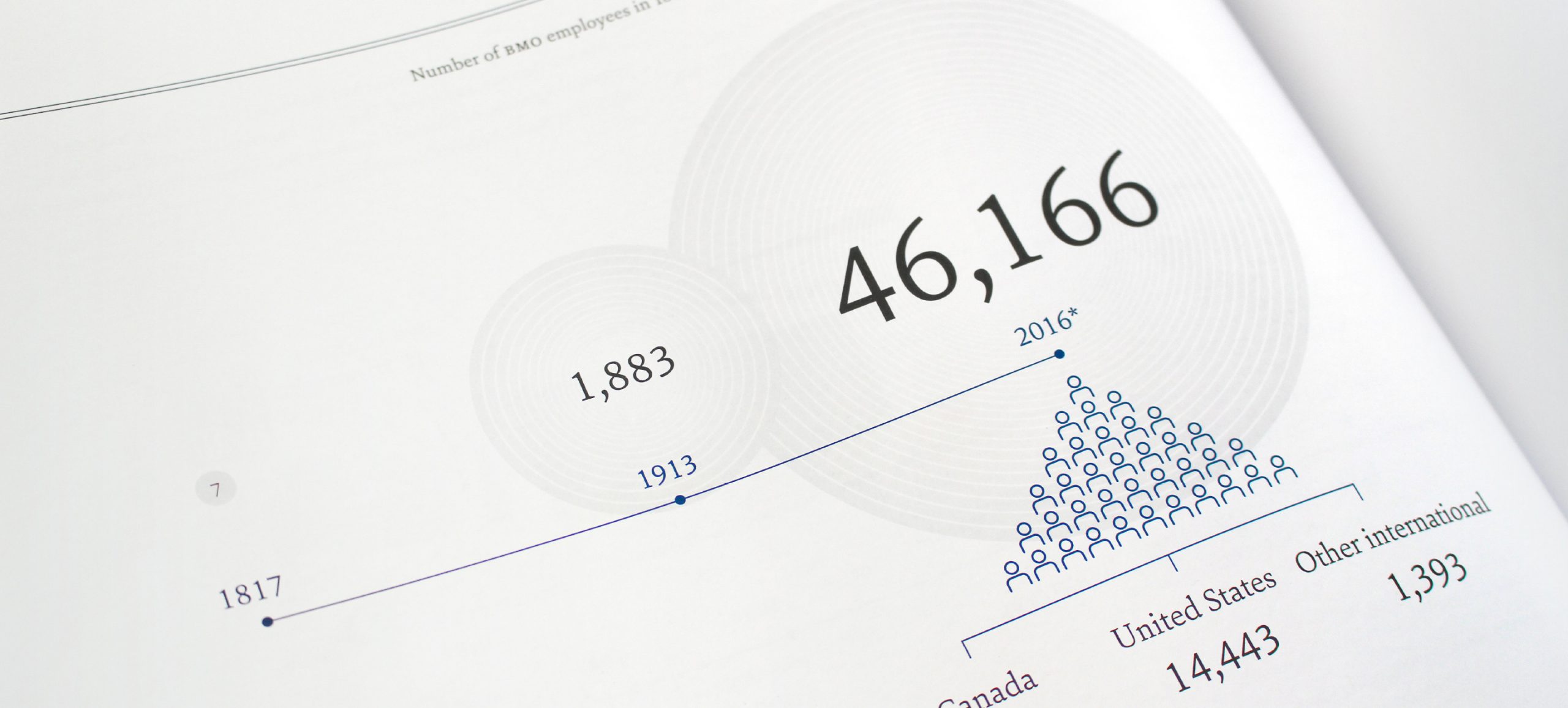
A Vision Greater than Themselves, By Laurence B. Mussio – Data visualization
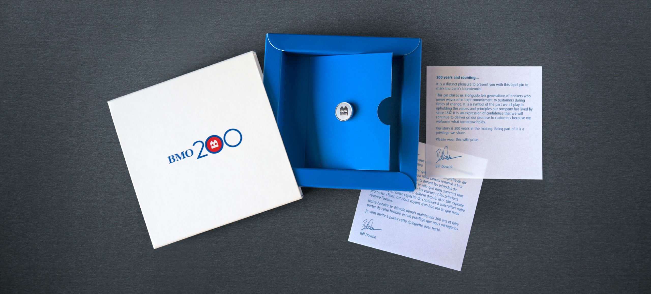
BMO 200 – Logo, pin and package
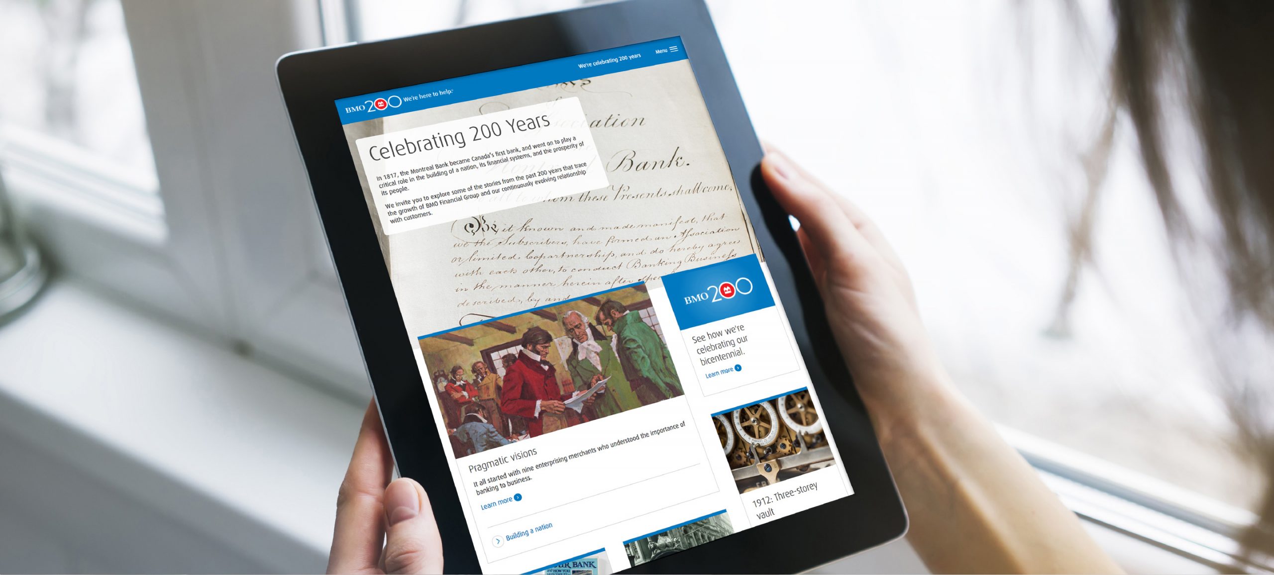
BMO history site
Creating community connections
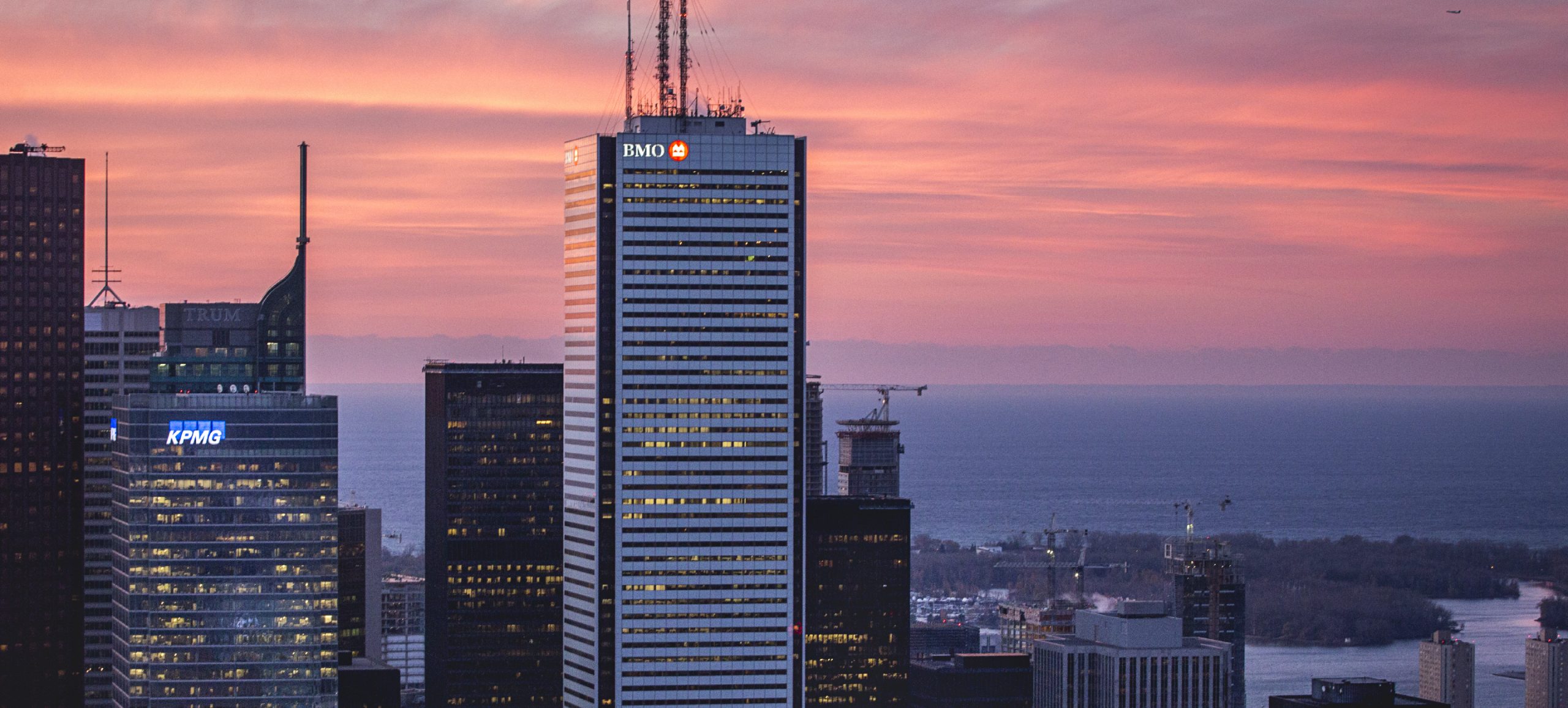
Across North America, BMO Financial Group is engaged in the communities it serves, supporting social progress and positive change. As their longstanding brand partner, Ove helps bring the BMO brand to life and reinforces its purpose to boldly grow the good. Through support of the arts, financial literacy, sport and social change initiatives, BMO is creating stronger communities. The BMO logo is iconic in towns and cities across Canada and in the U.S. markets it serves, and its ubiquity is a testament to BMO’s deep connection to its communities.
The First Canadian Place tower in Toronto with BMO logo signage designed by Ove (Photo by Christian Fleury)
BMO 1st Art catalogue
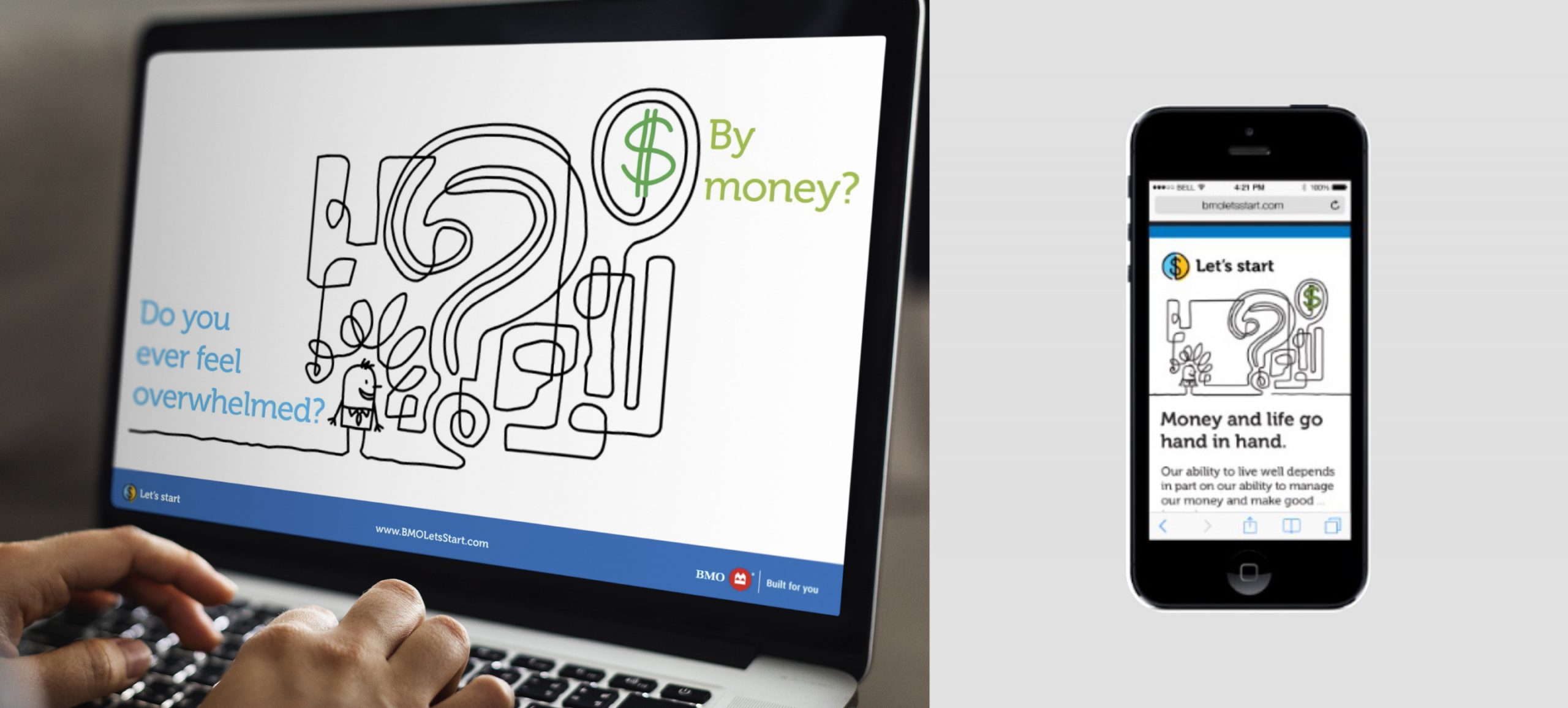
BMO Let’s Start financial literacy program
BMO Field creative
By its very nature, the work we do is forward-focused. It’s when we look back at our partnership with BMO over 35 years and counting that we realize how astonishing a journey it’s been and continues to be. It’s a testament to the power of collaboration, the strength of co-operation, and the importance of trust. Those things can only be forged between people. It’s always been – and always will be – about the people”
Monica Kessler, Managing Partner, Ove Brand Design