How do you give a new brand the credibility it needs and the freedom to evolve?
THE OPPORTUNITY
To support the province’s long-term development goals and meet rising infrastructure demands, Ontario’s Ministry of Finance launched the Building Ontario Fund (BOF) – a vehicle for attracting private and institutional investment into large-scale, revenue-generating projects that drive economic growth and deliver public benefit. With a broad mandate, multi-level government involvement, and an accelerated timeline, the Ministry needed a cohesive branding program that could establish immediate credibility and evolve alongside the organization.
THE OUTCOME
Ove partnered with the Ministry to develop a brand platform designed to evoke positive experiences for Ontarians, inspire loyalty, and build lasting brand equity within the Province. The resulting identity strikes a careful balance between the Fund’s independent role and its connection to the provincial government. From brand strategy to visual identity and system design, every element works together to convey trust, credibility, and a clear sense of public purpose – positioning BOF as a reliable vehicle for investment and long-term impact.
A distinct but connected brand
To meet tight timelines, Ove developed the brand positioning and visual identity for BOF in tandem – an approach grounded in insight-sharing across teams. The resulting strategy positioned BOF as a fiscally responsible partner connecting public and private investors with infrastructure projects that benefit Ontarians.
As the brand strategy took shape, so did the identity. This involved an iterative, collaborative process that engaged the client early and often.
Drawing inspiration from the Province’s visual identity (previously developed by Ove), the final brand strikes a balance between familiarity and distinctiveness, giving BOF a credible, future-focused presence from day one.
The face of the identity
Because this organization had its own board and would be managed by a team with sector experience, the identity had to be strong enough to stand alone, while linked to the Province. The resulting identity features a forward-pointing “O” symbol inspired by Ontario’s own mark, paired with provincial colours and typography.
Building the visual foundation
After a core team was established at BOF, the Ministry formally transferred the project to the Fund to complete with us. Our mandate included developing the visual identity system, creating brand asset templates, and building comprehensive brand guidelines.
At that point, the brand consisted of only the name, logo, primary colour palette, and font. Establishing a complete visual identity system became the immediate priority. To round out BOF’s brand toolkit, we needed to define a secondary colour palette, select fonts, determine a photography style, and explore potential graphic device.
Building Ontario Fund’s business plan was centred around five priority areas:
To support clear, consistent communication across these areas, we introduced a system of icons. Each icon served as a visual cue, helping identify and distinguish the Fund’s focus areas in communication materials.
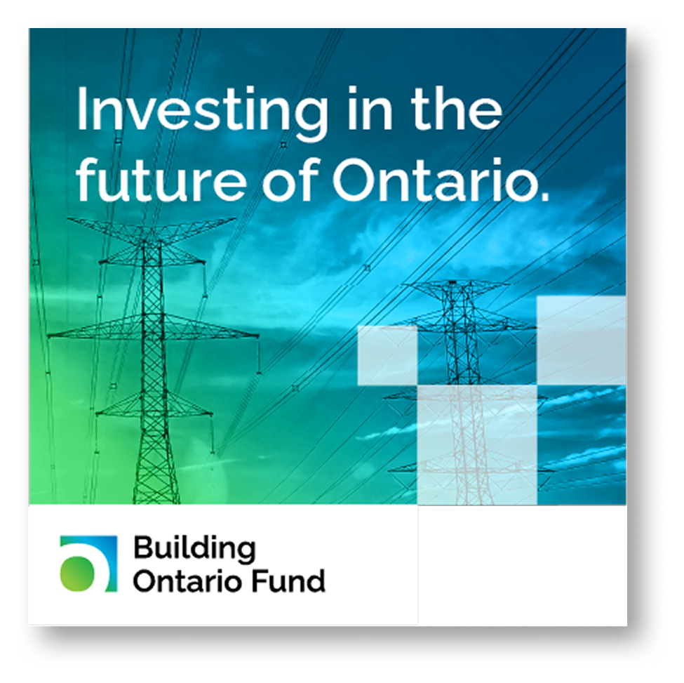
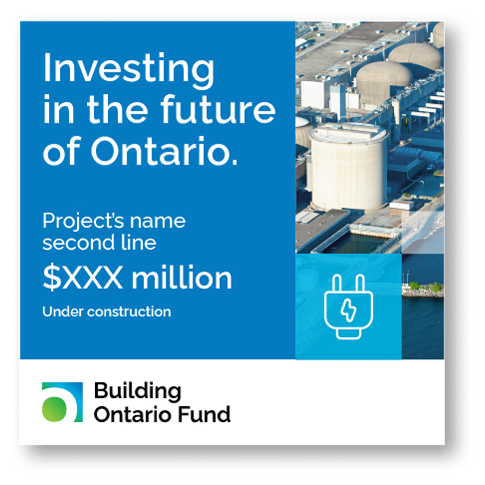
In parallel, we explored graphic devices that would capture the spirit of BOF. The most strategic of these was a square tile treatment, evoking the ideas of building, stability, and momentum. The tiles could be arranged in flexible layouts to suggest movement and progression.

To further emphasize BOF’s action-oriented and future-focused character, we introduced gradient and solid colour treatments, designed to be layered over shapes and photography, adding depth and visual energy to the brand.
Bringing the brand to life
In this start-up phase, BOF was focused on building a team and attracting investment. To support these goals, we worked with the head of communications to identify priority brand assets and develop a delivery plan.
The first task was email signatures, one of the Fund’s most-used communication tools. We designed an animated signature that reflected BOF’s brand values: knowledgeable, responsible, action-oriented, and future-focused. The upward motion and arrow shape suggest momentum and forward thinking.

Corporate website
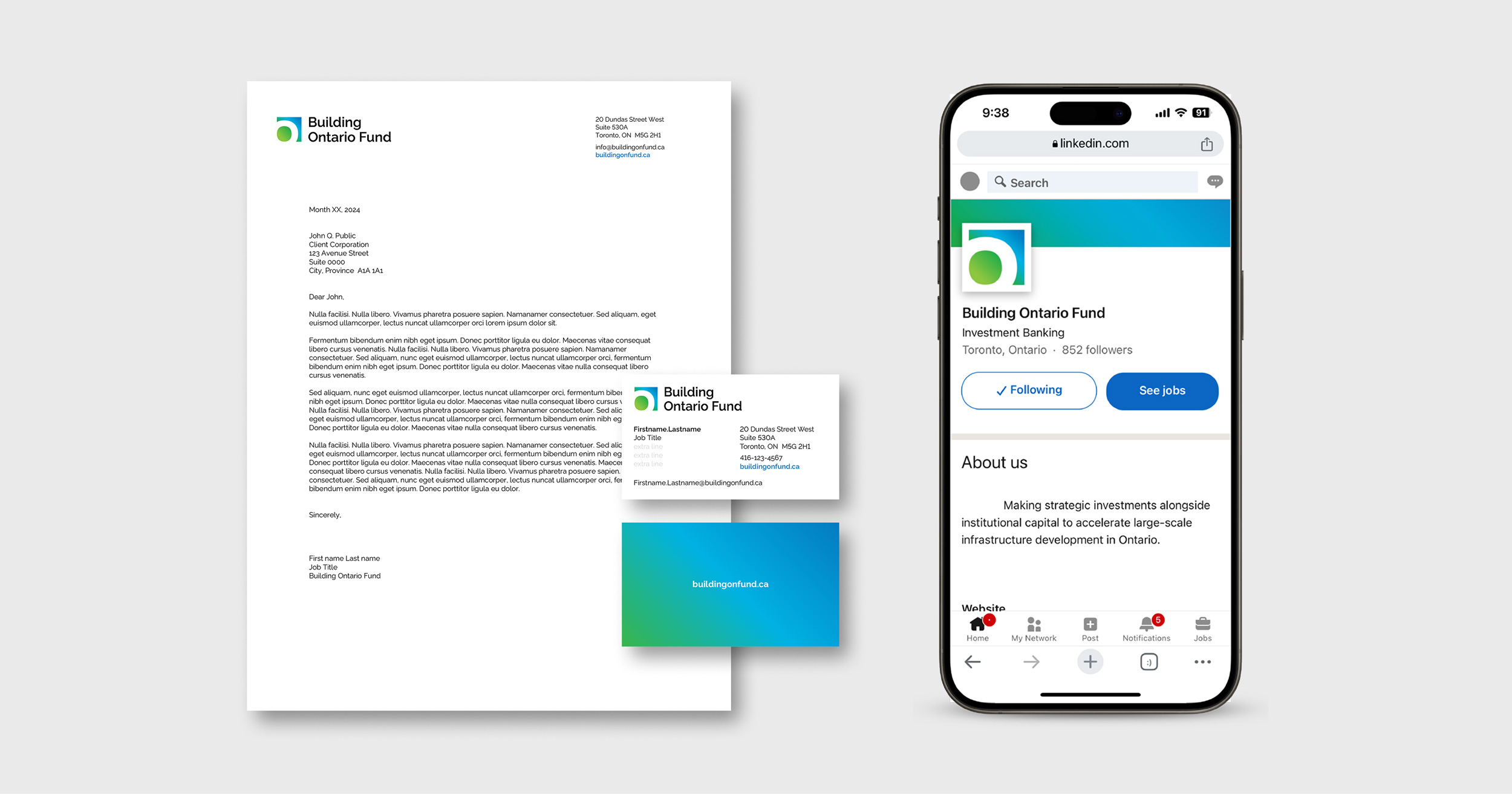
Stationery and favicon

One-pager and virtual background

Presentation cover

Pull-up banner
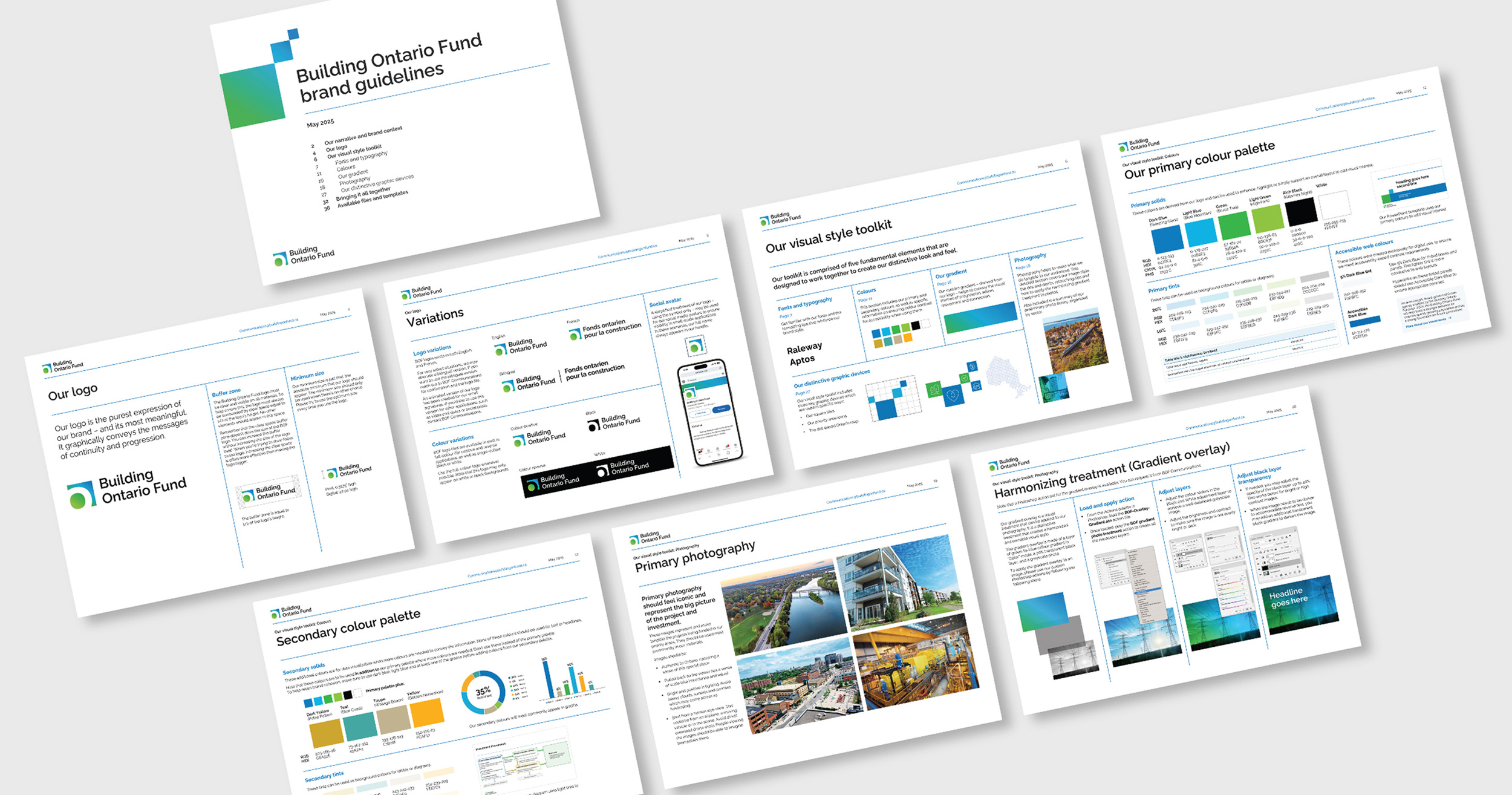
Brand guidelines
Once the visual identity system was complete, the next phase involved the development of guidelines to capture and explain how to use the elements of the visual style. This document is used as a guide for internal audiences and external partners, ensuring consistent application of the brand and increasing brand awareness.
Ove continues to work with BOF to expand their brand toolkit as the organization matures and their needs evolve.
Our contribution
- Research and insights
- Brand strategy and positioning
- Brand architecture strategy
- Naming and nomenclature systems
- Brand identity and system design
- Visual identity guidelines
- Website design and development