How can a brand align the intentions of one
with the needs of many?
How can a brand align the intentions of one with the needs of many?
THE OPPORTUNITY
Ontario colleges were under increasing pressure to meet the demand for more and better-quality educational opportunities by a wider array of students. Algonquin College had set out a five-year strategic plan to become the institution that would nurture the leaders of the 21st century. It understood its strengths, but would need a partner to help it articulate and communicate its difference in a meaningful and compelling way to diverse stakeholders.
THE OUTCOME
Ove created a new brand identity program that would enable Algonquin College to demand attention, compel interest and instigate action around their vision – empowering them to attract educators who want to teach, students who want to enrol, partners who want to align, and donors who want to support Algonquin College and what it stands for.
Defining the brand
Algonquin College had done the research to understand who it was, how it was perceived, and how it would deliver an exceptional experience. Our challenge was to align these points of value to a clear, compelling brand and visual expression.
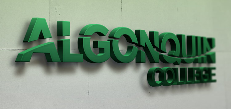
Based on the research, Ove identified five key themes that differentiated the Algonquin experience. This was distilled into a concise brand framework that would provide the groundwork for aligning the work to come. Among other things, it included a compelling positioning statement and a core brand idea of “connected.” This would frame messaging about how Algonquin is connected to the future, to the workplace, to ideas and inspiration, and to new perspectives on learning and life.

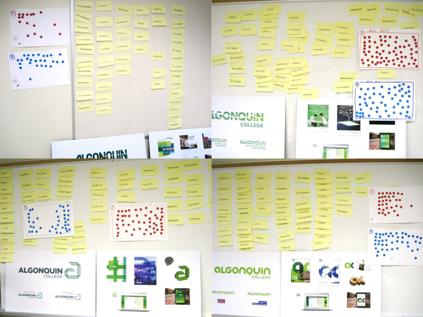
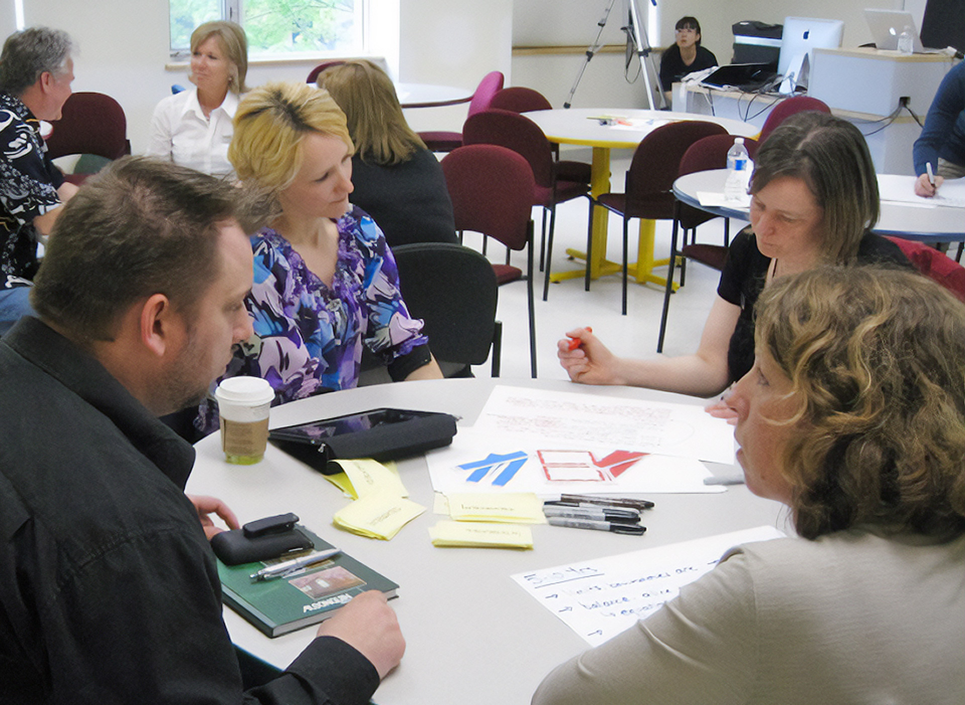
Putting concepts to the test with the people who matter
Exploring visual expressions of the theme of connection, Ove landed on four identity concepts to take into testing. We facilitated 10 workshops in Ontario comprising 6 groups of internal stakeholders (campus staff, faculty and students) and 4 groups of external stakeholders (guidance counsellors and prospects). After taking participants through a number of exercises that challenged them to explore what “connected” meant to them, we asked them which visual direction they felt best captured the idea.

Creating a versatile set of identifiers
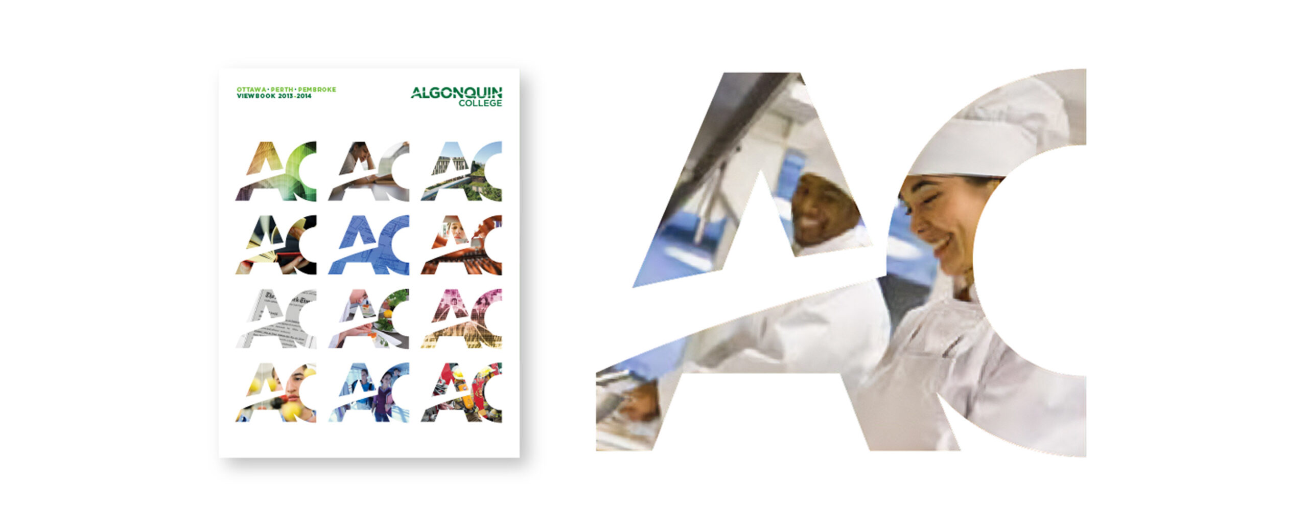
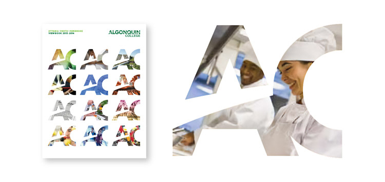
Ove refined the favoured brand design – with the theme of connection represented by a fluid line connecting the letters of the wordmark. An icon was also developed to represent the brand in limited-space applications. It would also be used as a feature element – a container for imagery, patterns and ideas that directly relate to the publication or the environment in which it is seen. This would allow for a broad range of expression while supporting a consistent visual style.
Making it work for everyone
Ove created a standardized approach to sub-brands, making sure that individual schools, programs, departments and services within Algonquin College would carry the brand forward in a consistent way. An additional wordmark lockup was established to enable the College to indicate that a message or piece of communication comes from a specific program or internal department, while a similar lockup was created for geographic regions the College operates in.
Designing it forward
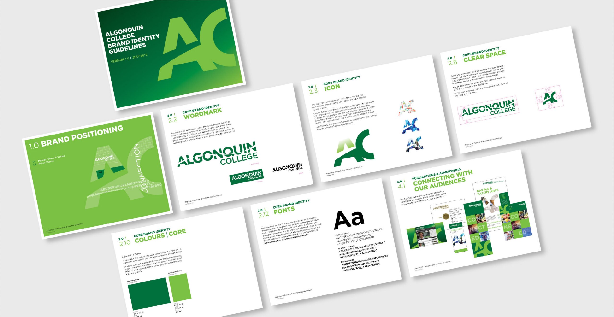
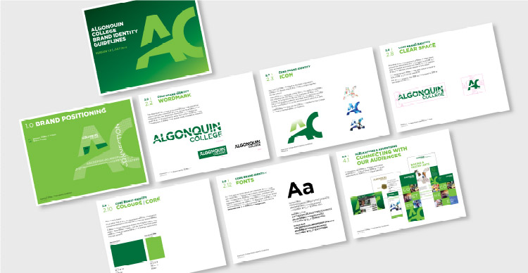
We followed the visual identity work with comprehensive guidelines that explained the strategic positioning of the brand and included detailed specifications and sample applications for its implementation. These ranged from social media and signage to diplomas and branded merchandise. A variety of templates, including key web pages, were developed to support the internal design team going forward.
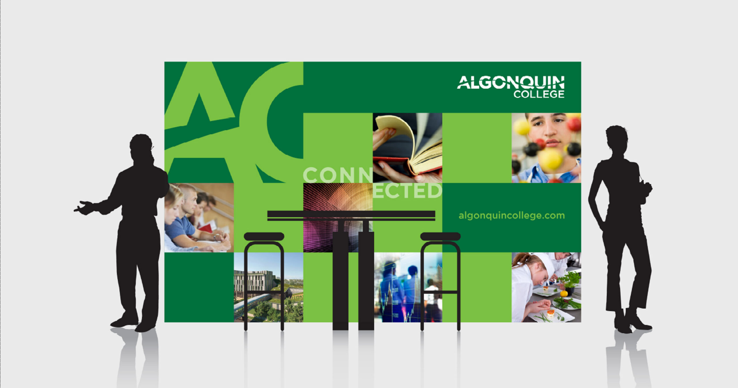
Trade show booth 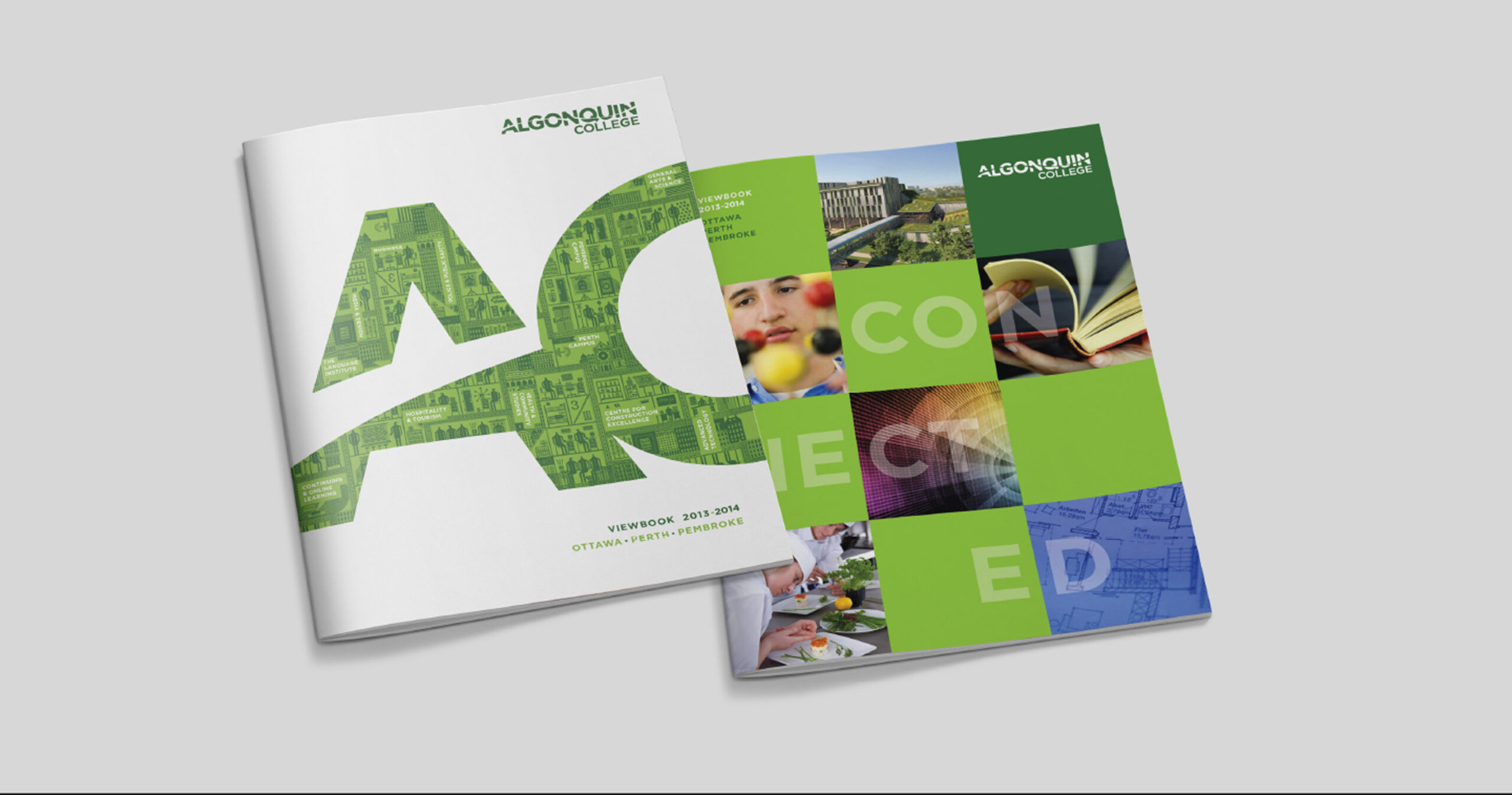
Publications 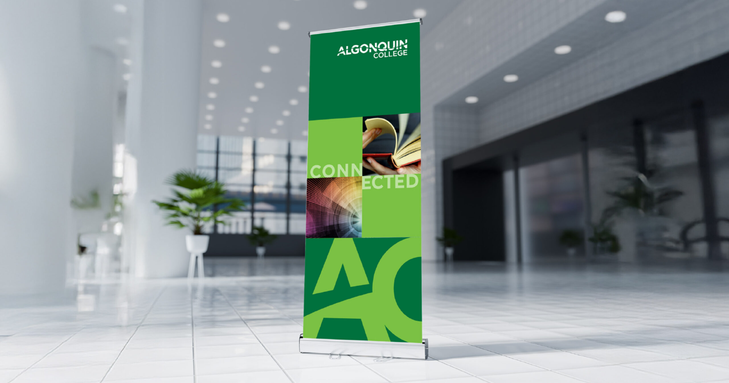
Pull-up banner 
T-shirt 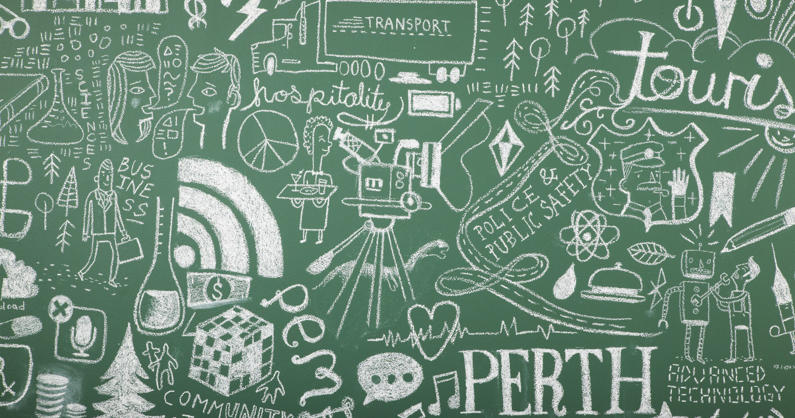
Mural
Going beyond
Ove continued to partner with Algonquin for another three years, designing several key collateral pieces based on the new visual identity. These included individual program posters and brochures, and cover designs for the College Viewbook.
Our contribution
- Research and insights
- Brand identity design
- Visual identity system and guidelines
- Publications and advertising
- Signage and wayfinding


