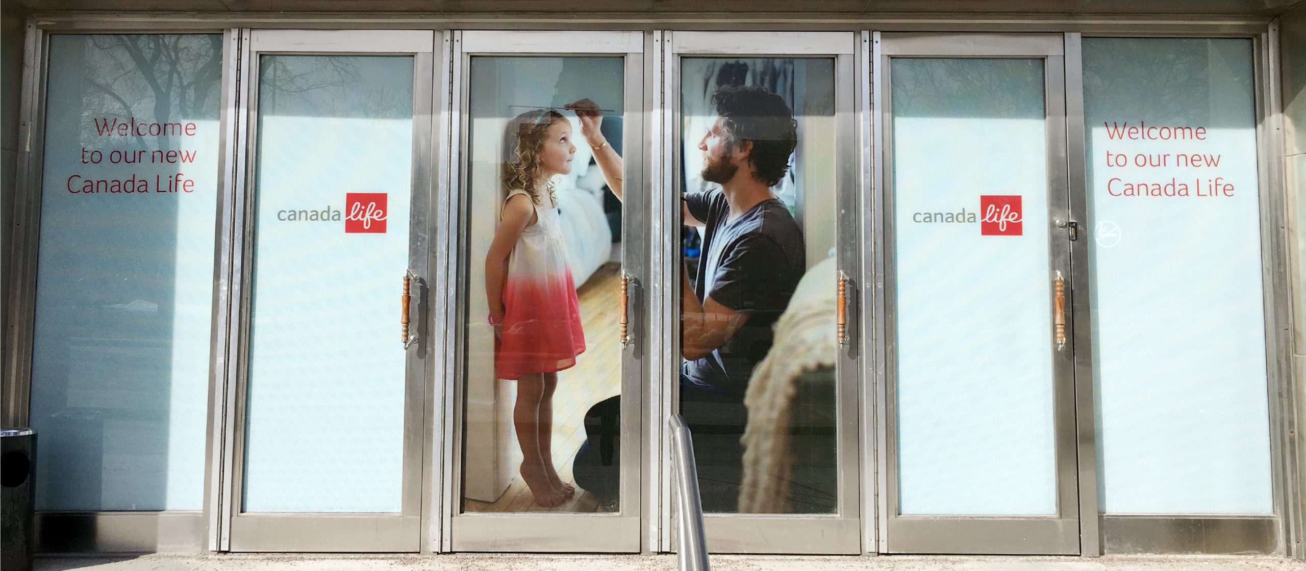
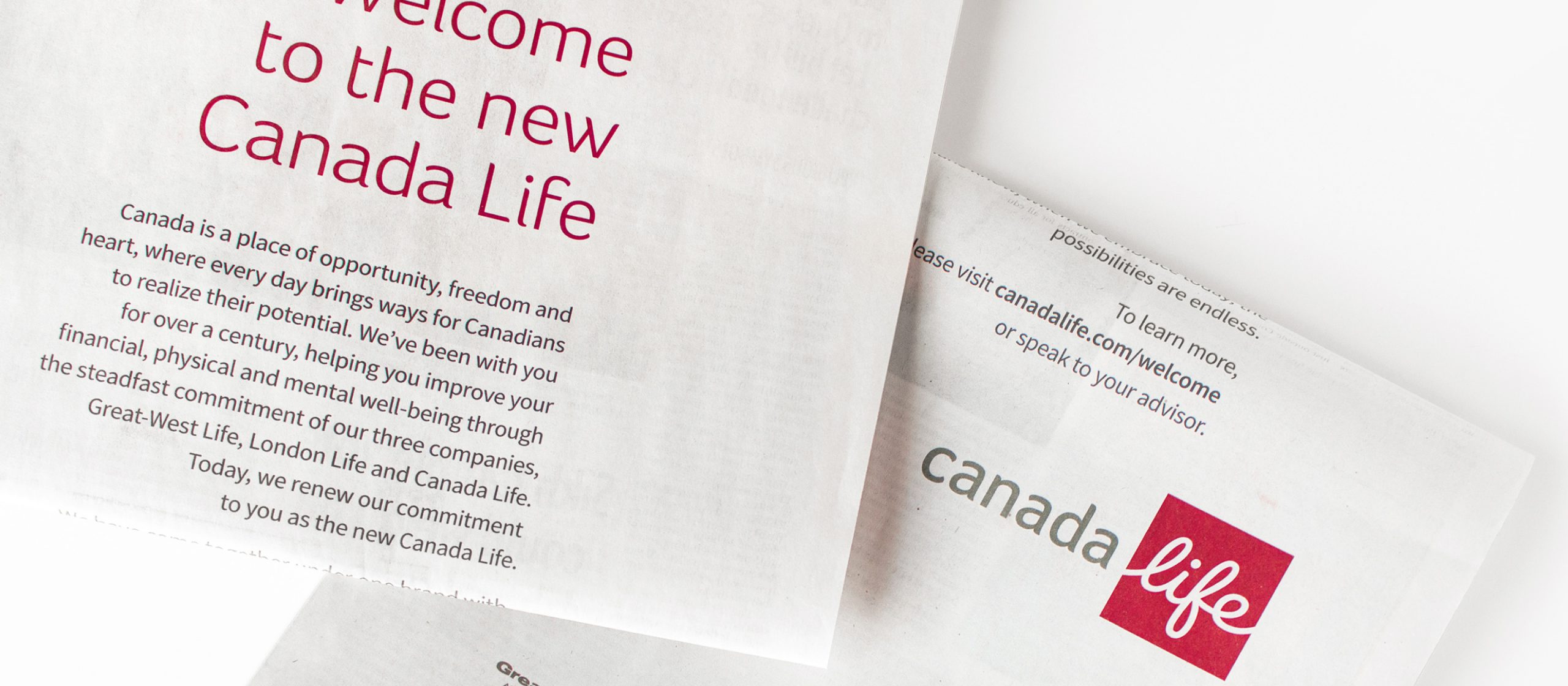
How can brand clarity bolster growth?
How can brand clarity bolster growth?

THE OPPORTUNITY
Fast-paced growth often comes with the risk of brand fragmentation – that’s what Sagard, an emerging alternative asset manager, was experiencing with its success. It needed a way to drive future growth decisions without adding complexity for its stakeholders.
THE OUTCOME
In line with Sagard’s business strategy, Ove developed a sustainable and flexible masterbrand architecture model. To support it, we created nomenclature guidelines and brought the new brand to life with a brand strategy and identity that leaned into Sagard’s Canadian roots and network to create distinction in the category.
Building a global Sagard branded house
Sagard, a fast-growing alternative asset manager, needed help to ensure its relatively young brand caught up with its business successes, growth and aspirations. As an emerging player in the industry, Sagard needed to define its unique brand position and voice in the market.
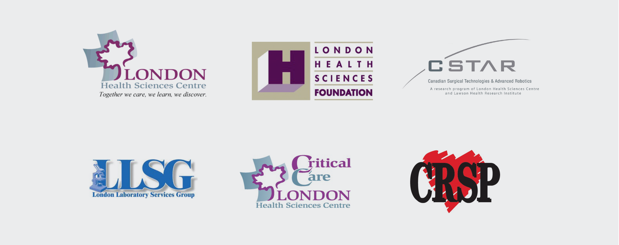
Complexities were considered when it came to Sagard’s existing businesses: a European division that had long-standing brand equity, a recently acquired private wealth business still finding its place in the ecosystem, and two venture businesses that had already been operating as independent brands.
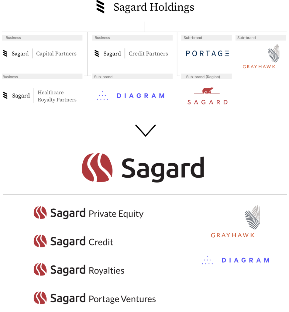
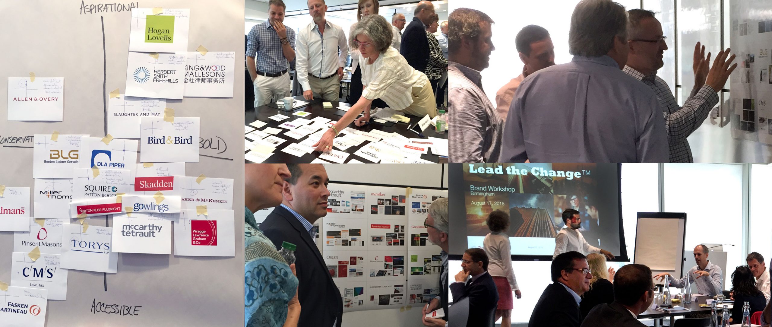
After conducting internal and external stakeholder interviews, as well as collaborative working sessions with the leadership team, the consensus was that a global Sagard branded house would be the optimal solution for the future. Development of interim/transitional phases were required to seamlessly bring existing businesses under the Masterbrand while managing the risks involved. Additionally, “Holdings” (part of the legal name “Sagard Holdings”) was removed for the overarching brand name to better align to the desired future state.
This new brand architecture strategy offered Sagard simplicity to its stakeholders, and equally as important, allowed for them to convey the power of its platform as the company continued to grow.
The power of the Sagard network
Through the stakeholder interviews, one particular insight unlocked the essence of the new Sagard brand: for those who interacted with the people behind the organization, there was a sense of community, shared purpose and advantage that was made possible by Sagard’s unique network of business builders who helped each other learn, grow and win.
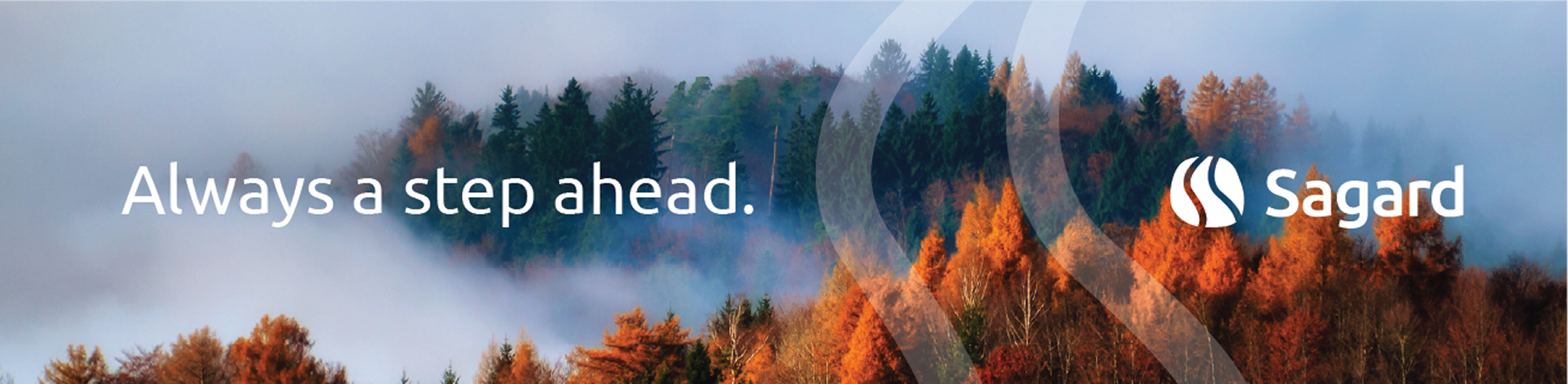
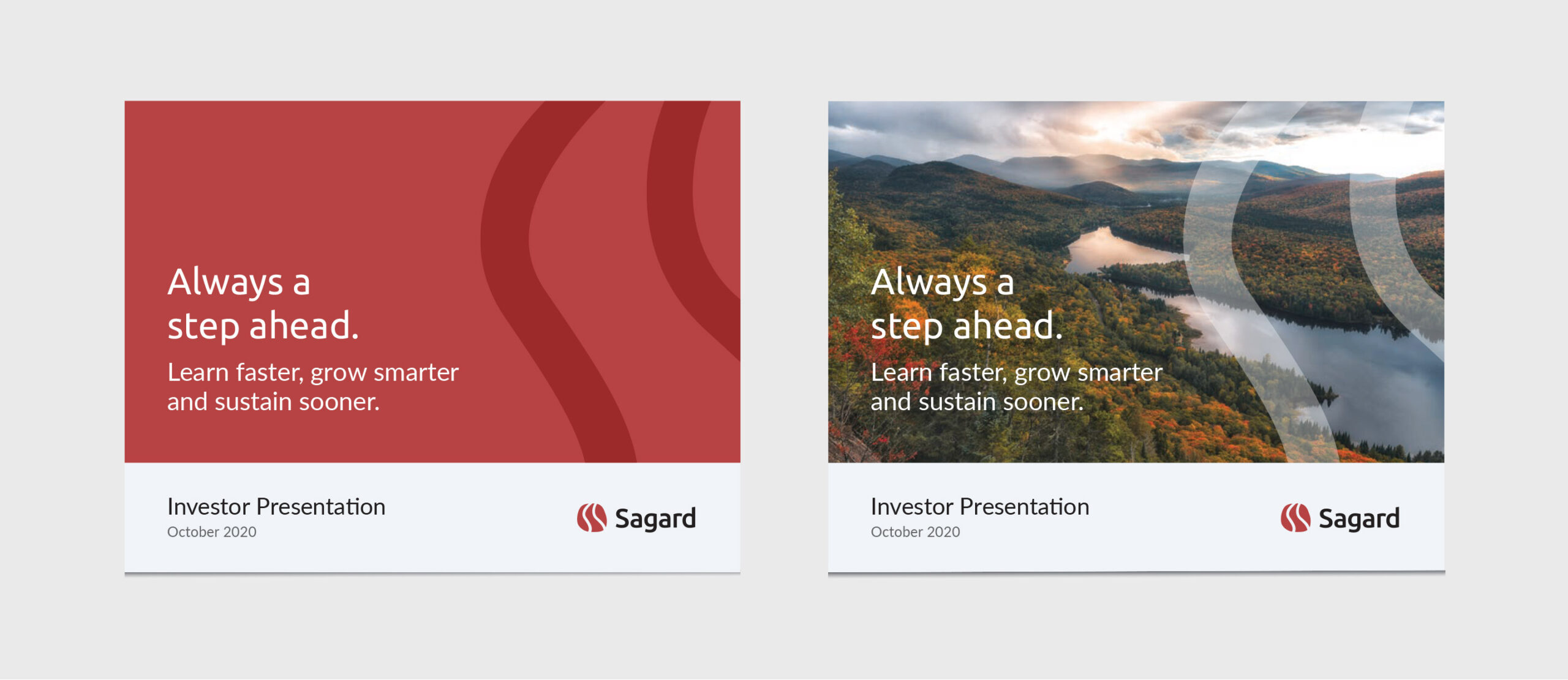
This idea manifested in Sagard’s new brand positioning and value proposition, Always a step ahead, and inspired the new tagline, Capital. Culture. Network.
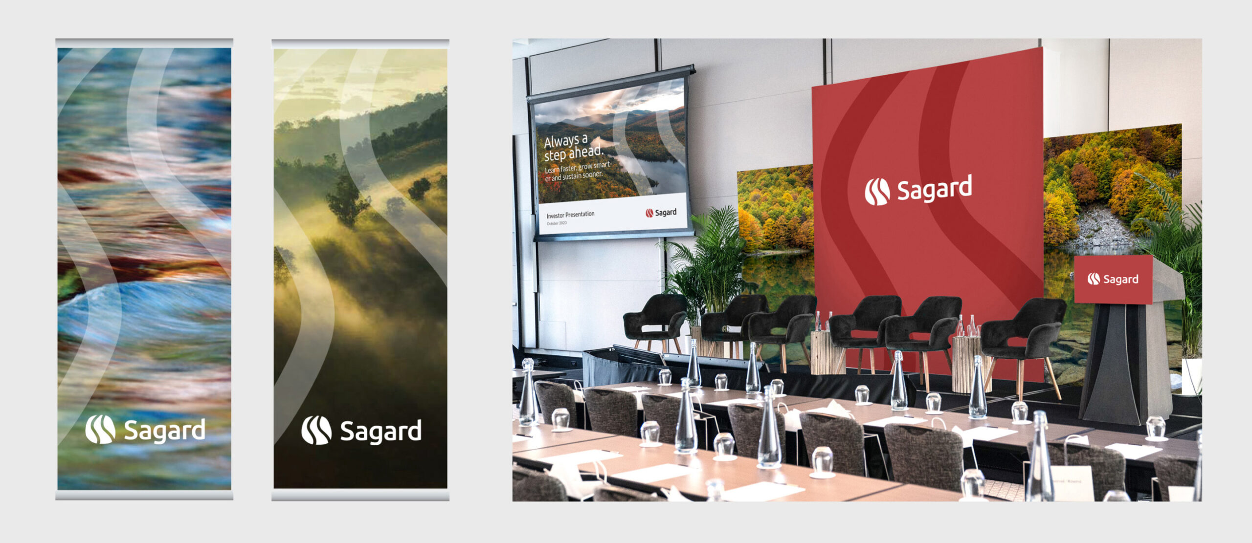
A brand identity inspired by Sagard’s nature-driven roots
Grounded in the ideas around Sagard’s network and community as the main source of advantage, Ove sought a design solution that would also incorporate the organization’s unique roots, as it was named after a geographic region in Quebec, Canada.
The solution also needed to balance the challenge of standing out as an emerging player in the category, while still achieving a sense of professionalism and elegance that is essential in the financial industry.
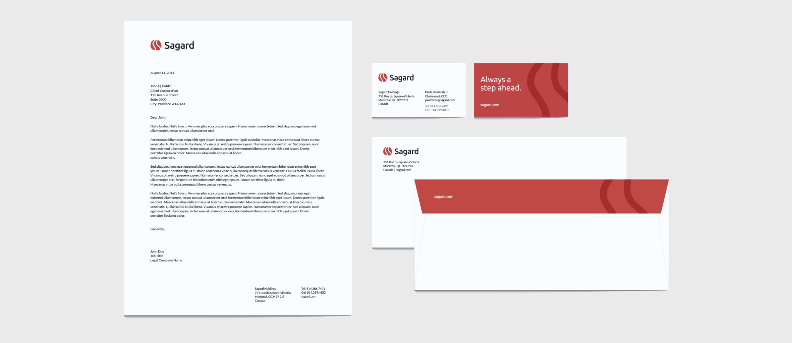
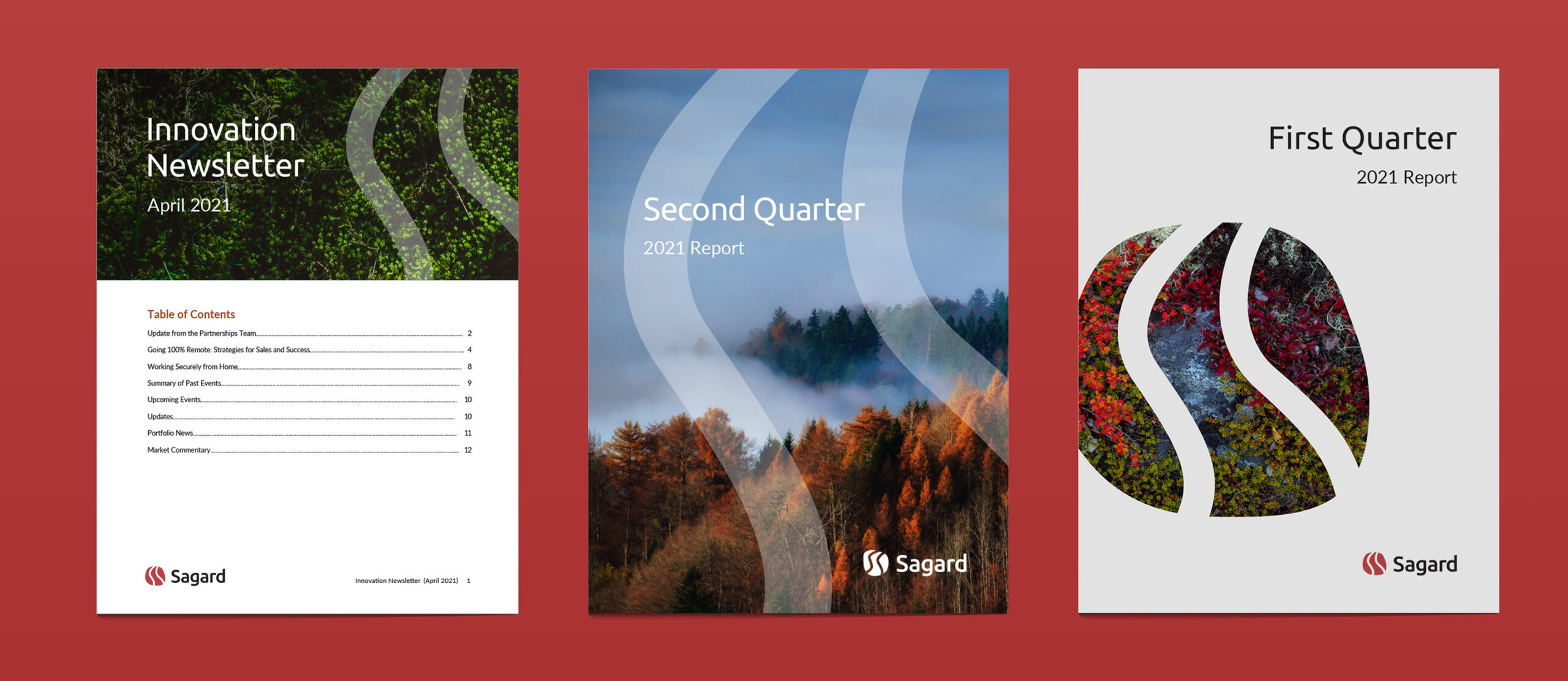
The result was a logo in the shape of a river stone with two organic lines running through to depict collaboration, network and leading the way. The nature motif was carried throughout the visual system in the colour palette, as well as Sagard’s imagery style that features vast, majestic landscapes which would be unique in the financial category.

Brand implementation, designed with growth in mind
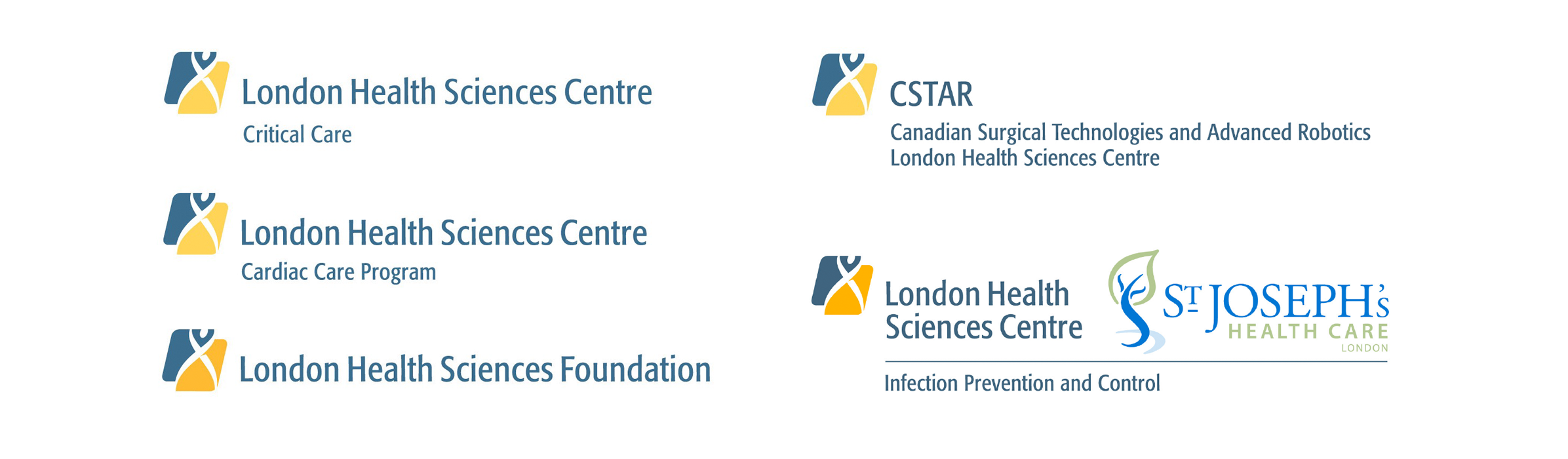
As the project scope grew from brand architecture to strategy and identity, it was clear that elasticity and flexibility were guiding principles – this also applied to brand implementation. In anticipation of new lines of business in the future, Ove developed a standard business logo configuration based on the new overarching Sagard logo.
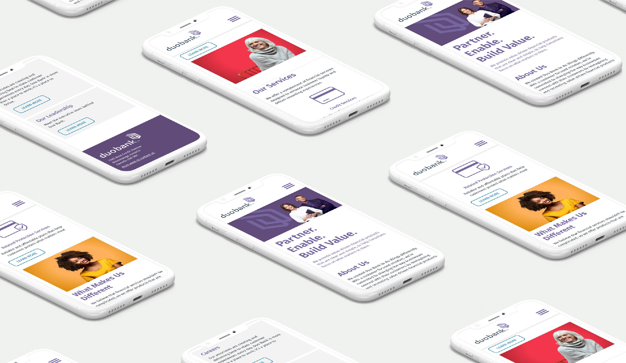
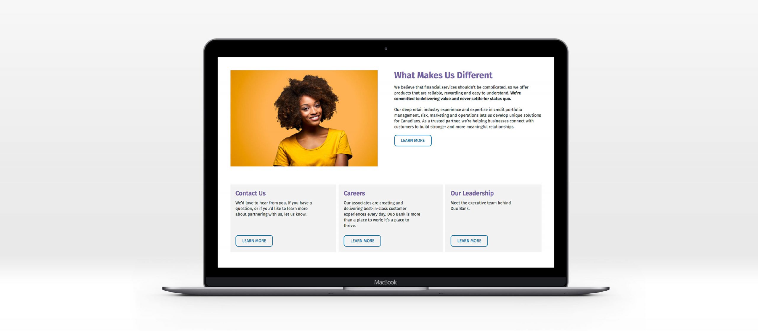
Having already gained a deep wealth of knowledge around Sagard’s business and new brand, we partnered with Publicis’ sister company Nurun to create Sagard’s new website. In anticipation of future growth, it was crucial that we designed and built the website in a manner that would allow the client to easily make updates on their own terms. Integrating UX and design strategy, the result was an intuitive and elegant website that embodied the Sagard brand architecture, strategy and identity work.
Our contribution
- Research and insights
- Brand strategy and positioning
- Brand architecture strategy
- Naming and nomenclature systems
- Brand identity and system design
- Visual identity guidelines
- Website design and development