How do you evolve a brand to keep
up with global ambition?
How do you evolve a brand to keep
up with global ambition?
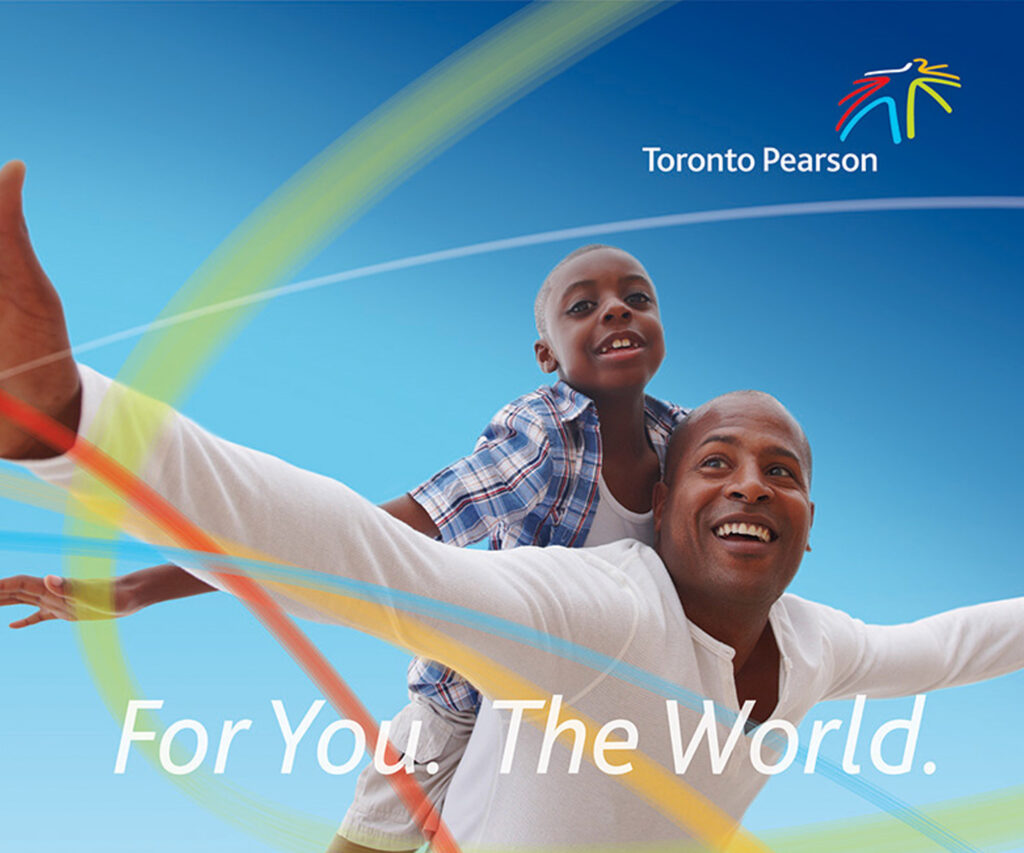
THE OPPORTUNITY
As a challenger brand, WestJet had set its sights on becoming one of Canadaʼs most iconic companies, and it needed its brand to match this ambition. Its brand identity required refinement to align with the airlineʼs business goals and evolving dynamics.
THE OUTCOME
Through the course of our eight-year relationship,
we helped the WestJet brand evolve alongside the
company’s journey. The brand expanded its scope
to encompass the magnitude of a full-network
global airline.
The take-off
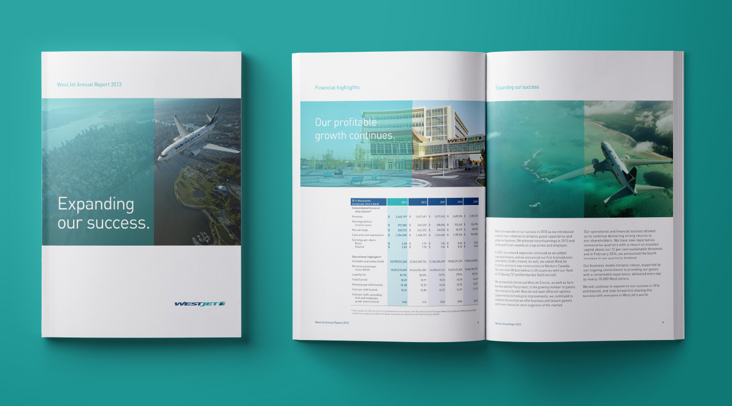
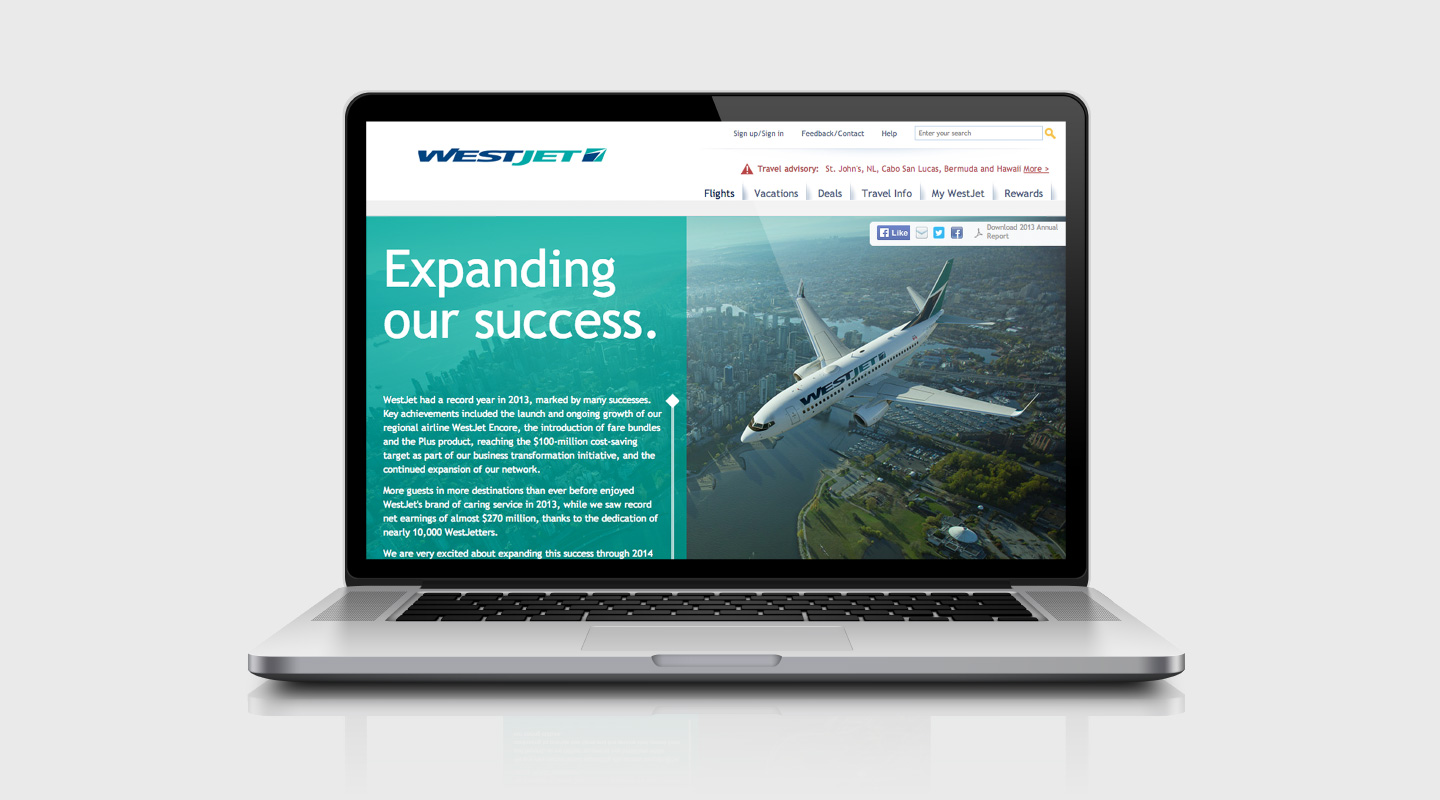
Our long association with WestJet started just as the company was poised for significant expansion into new geographies and markets. WestJet turned to Ove to provide the necessary strategic and creative guidance for stakeholder engagement. The journey began with an online and printed annual report that successfully engaged and gained confidence from employees and potential investors. This project quickly evolved into a series of critical endeavours to build a brand that could sustain exponential growth.
The journey
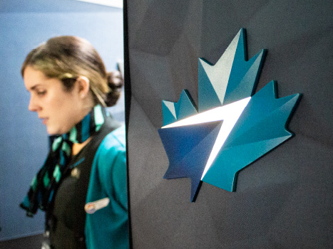
While the pride of being a WestJetter was fostered under their “Owners careˮ program, the external expression of the brand was fragmented and its impact diluted. Ove was given the task of harmonizing all aspects of the WestJet brand expression and tools allow for its successful implementation.

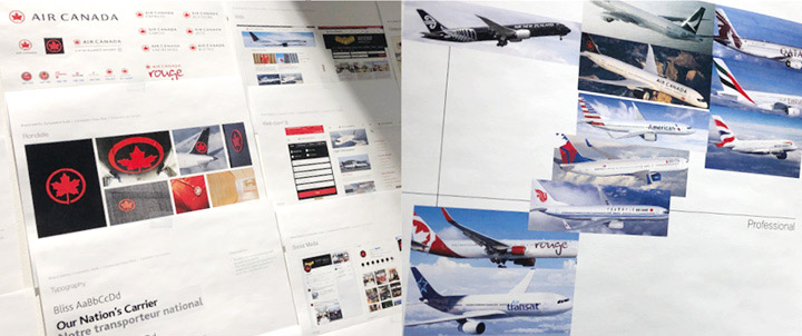
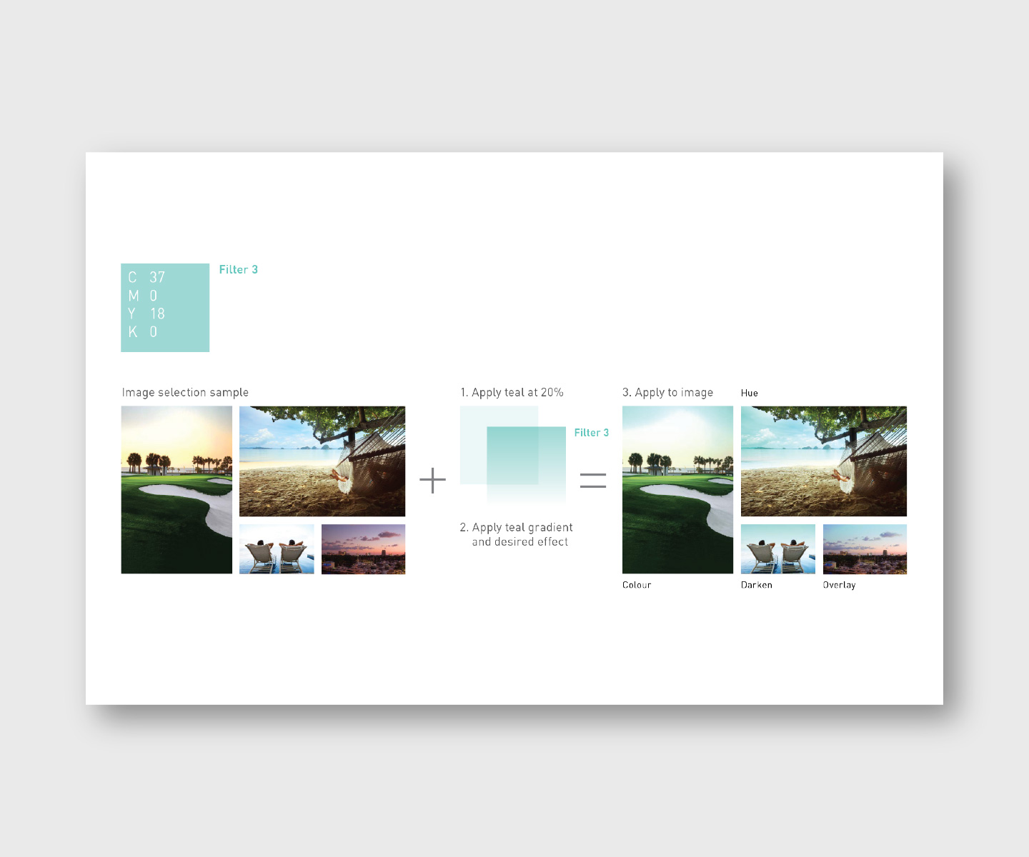
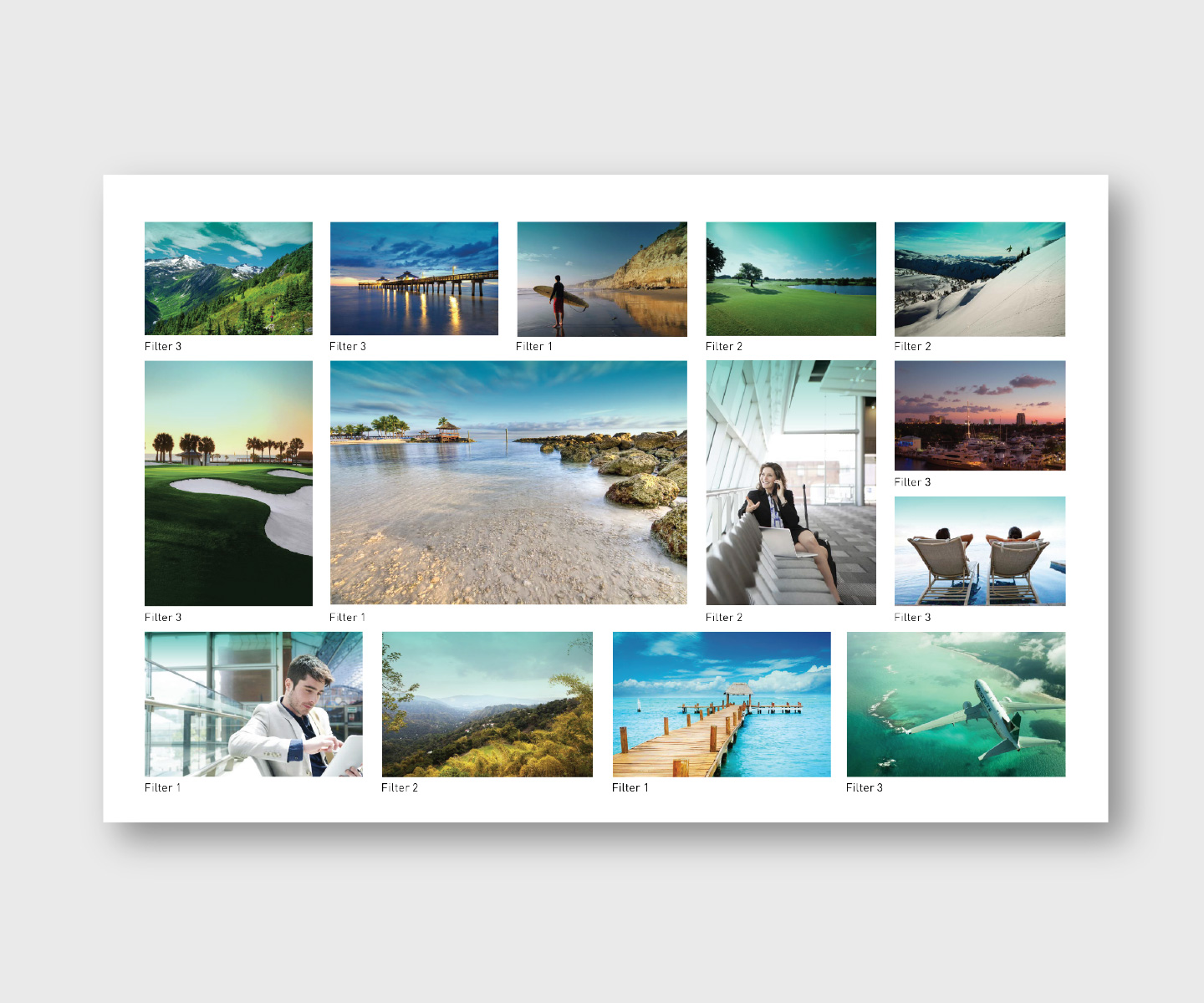
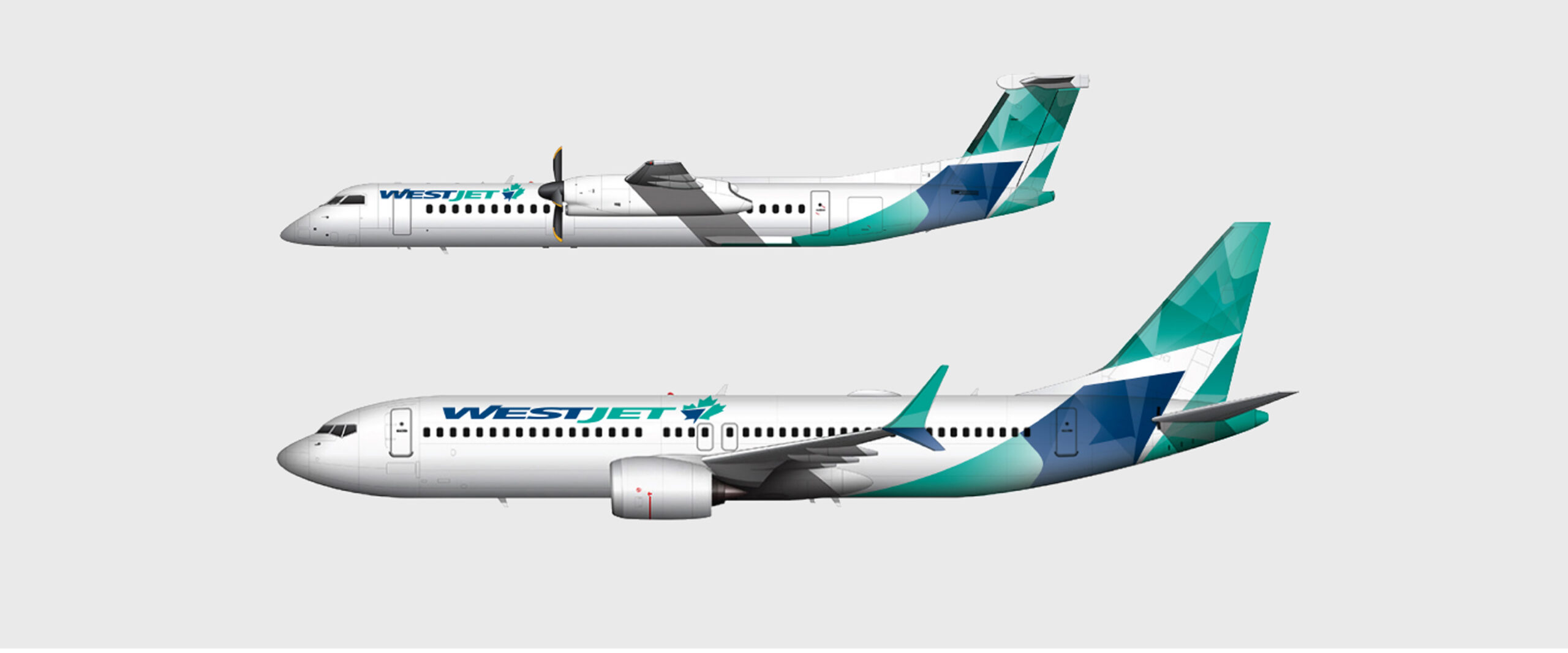
A competitive audit of the airline industry revealed an opportunity to amp up the use of WestJet teal as an “ownable” brand colour. In a workshop with the WestJet team, Ove proposed multiple design applications, a new version of the symbol, and a fresher, brighter colour palette featuring shades of teal, which was even applied to imagery with a unique teal tint filter.
A terrific opportunity to reset on ‘what does our logo look like, what does the Aircraft livery look like’, and we took advantage of the situation to essentially introduce a whole new WestJet.ˮ
Richard Bartrem, VP Marketing Communications, WestJet
Ove also created fractal graphic treatments that were used in both aircraft and environmental design, including aircraft interiors and airport signage. The power and impact of this system are now evident across all of WestJet’s current expressions and touchpoints.

Helping the Maple Leaf fly to London
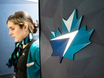
As WestJet expanded into the European market and launched flights to the UK, Ove was engaged to highlight the companyʼs Canadian roots by incorporating a maple leaf into the brand identity. Being Canadian brought a set of positive values – trusted, fair, and friendly – that perfectly aligned with the WestJet brand but weren’t always emphasized.
Ove implemented a “Canadian-izingˮ of the overseas aircrafts with a new “maple leafˮ design, which remained anchored in the original wordmark.
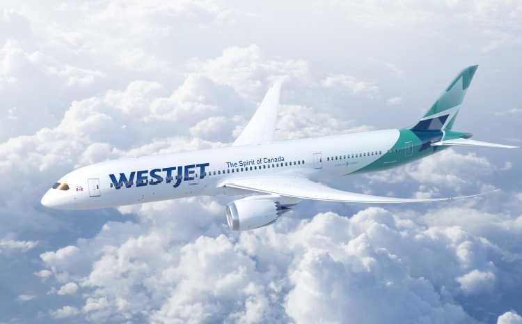
The journey continues: A new era for WestJet
While the maple leaf identity was originally introduced as the airlineʼs international logo, the purchase of 10 Boeing 787 Dreamliners in 2018 prompted further exploration and evolution of WestJetʼs brand identity and applications. With WestJet now operating as a full-network global airline, it was time to elevate and comprehensively review its identity.
The original two-colour wordmark emphasized the airlineʼs origins in Western Canada, which didn’t support its role as a global player. Ove recommended an identity that transcended borders to embody a global personality. The name was unified through the use of a single colour, instantly de-emphasizing the word “west.”
The world had changed since the introduction of the WestJet wordmark, with digitalization impacting all communication channels. Ove updated the wordmark with a more modern, legible, digital-friendly typeface.
Perhaps a fitting testimony to this brand success story was the fact that fifteen months after the first WestJet Dreamliner took flight, WestJet was purchased in a $5-billion deal by Onex Corporation.
Our contribution
- Research and insights
- Brand identity design
- Visual identity system and guidelines
- Signage and environmental
- Annual and sustainability reports