Repositioning the Richardson brand
From disparate business lines to one unified identity, we helped Canada’s largest agribusiness prepare its brand for the next chapter

Repositioning the Richardson brand
From disparate business lines to one unified identity, we helped Canada’s largest agribusiness prepare its brand for the next chapter.
After years of growth, Richardson International had expanded to encompass multiple consumer and industrial divisions, each with its own visual language and marketing approach. Over time, this made it more challenging to present a single, coherent story. As the company set its sights on expansion into new markets, it needed a clearer sense of how to articulate its identity to support its next phase of growth.
This required more than a logo update. Richardson needed a positioning framework that could simplify how the business communicated its brand essence consistently across every touchpoint.
We undertook a considered restructuring of the entire brand system, unifying the seven business divisions under a single master brand and visual identity system.
On the logo itself, we made subtle refinements to the existing mark to help it function in a digital-first world, ensuring clarity across signage, screens, and modern applications. Critically, the updated logo retains the character of the original, honouring the company’s long history and family roots while giving it a more contemporary feel. A refreshed blue and brighter gold preserve the brand’s equity while helping it stand apart from key competitors.
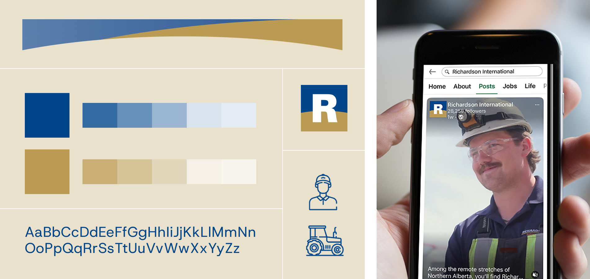
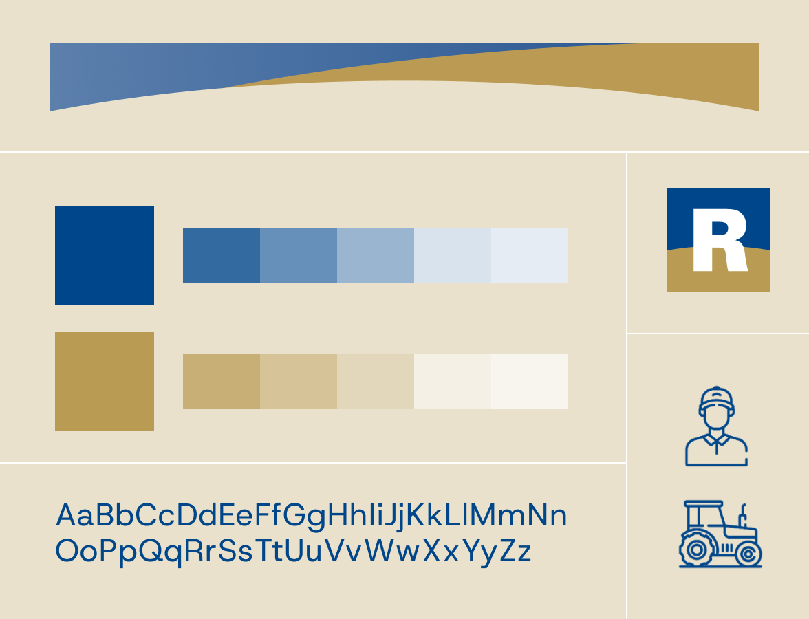

Beyond the logo, we developed a cohesive visual system encompassing a range of branded applications, giving Richardson a consistent creative language to deploy across its many business lines. We worked closely with Richardson’s internal design and communications teams to ensure the system supported their needs and addressed the specific challenges and nuances of their business.
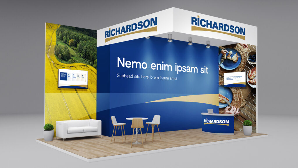
The outcome is a brand identity that feels rooted in Richardson’s heritage while designed for its future ambitions. With a unified design system in place, Richardson International is positioned to scale confidently into new markets with a clear and cohesive brand, expressed consistently across the organization as the identity is implemented over time.