How does a leading hospital
become greater than
the sum of its parts?

How does a leading hospital become greater than the sum of its parts?
THE OPPORTUNITY
Innovation and demand can lead an organization into new territories of growth, often to the detriment of a cohesive identity. London Health Sciences Centre had become a diverse network of health service providers and innovators. But it could achieve far greater things as a more fully integrated patient care, research and teaching hospital with a shared vision.
THE OUTCOME
A unified naming structure, brand identity system and messaging strategy helped to deliver the institutional clarity LHSC would need to succeed in its hospital restructuring initiative and achieve its strategic priorities.
London Health Sciences Centre (LHSC) is one of Canada’s largest academic health sciences centres, providing exemplary patient care, advancing medical research and educating the next generation of health professionals. Ever evolving to meet the growing and complex needs of patients, families and communities, it has became known as much for its innovation in research and treatment as for its care-focused community hospital.
When the message gets lost in the mix
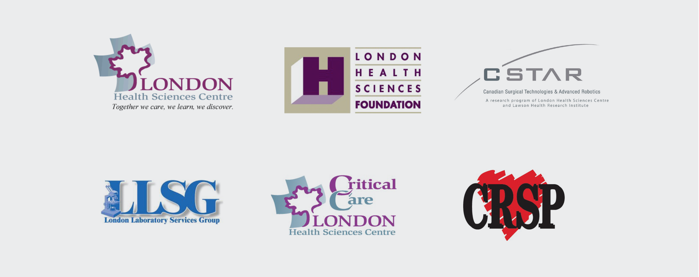
LHSC had earned worldwide recognition for leading in multiple areas of specialized care. But it was operating with multiple names and identities for its sites, departments, and foundation—contributing to a lack of clarity, a fragmented patient experience, and lackluster fundraising. With growing public expectations for transparency and integrated care experiences, LHSC saw the need to modernize and unify its brand and messaging to reflect its scale and commitment to shaping the future of health care.
Bringing the people and the pieces together
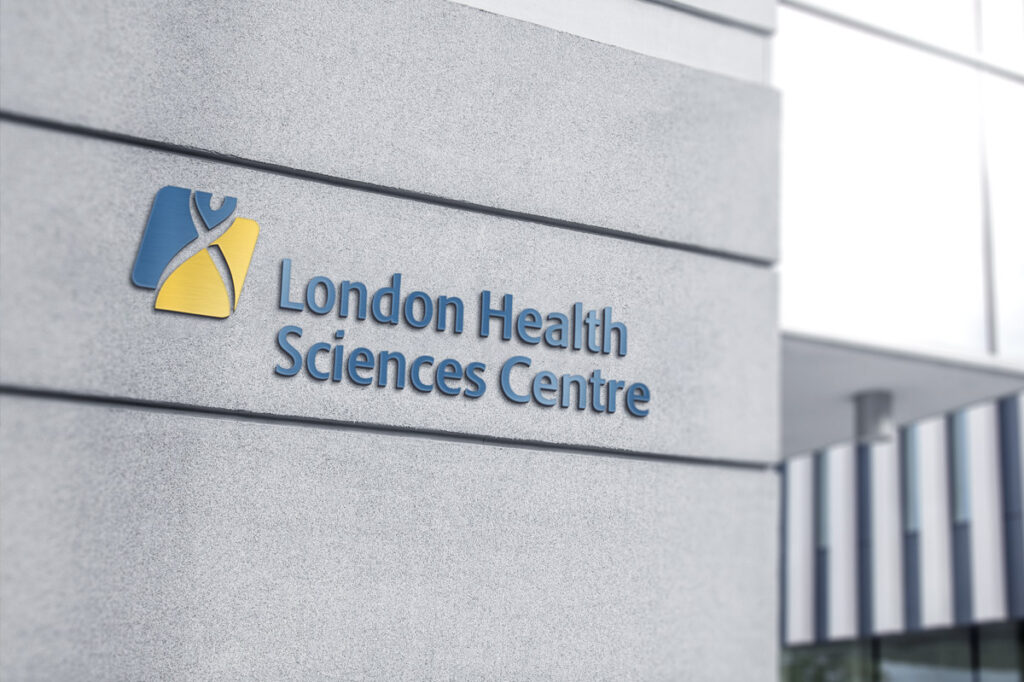
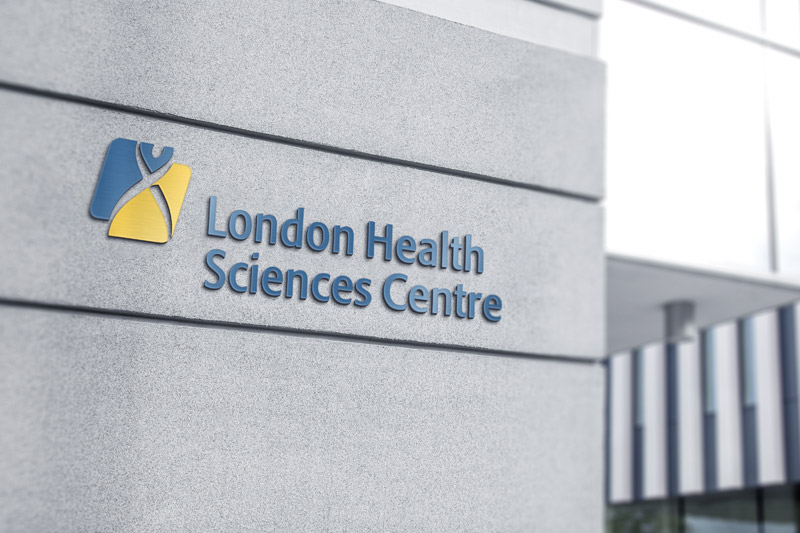
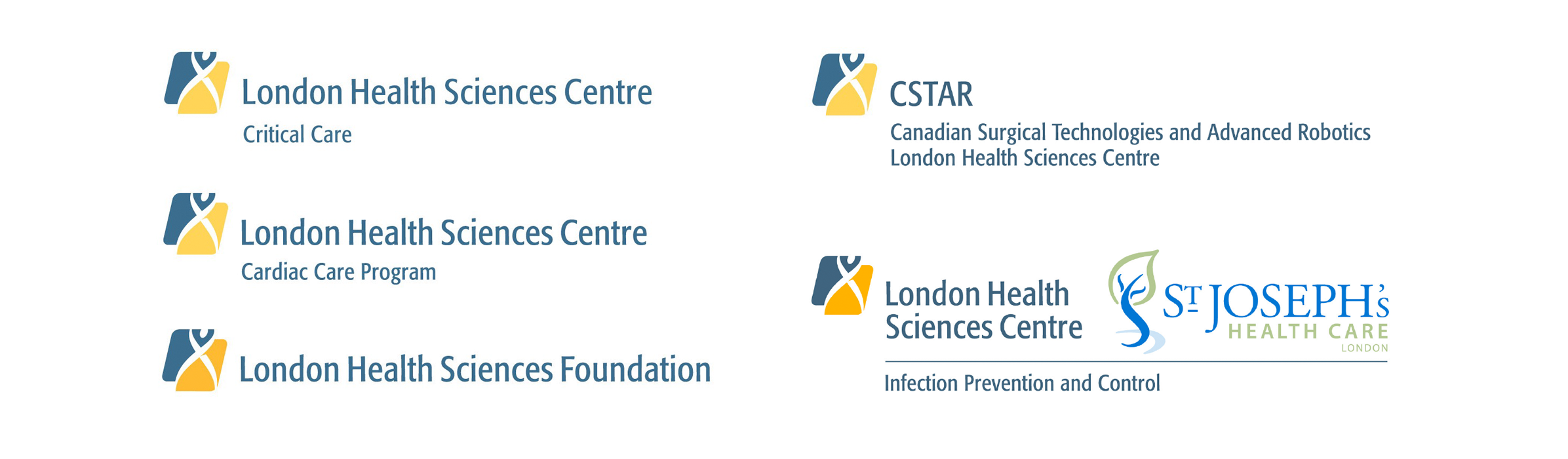
Ove consulted with diverse stakeholders, including doctors, staff and the boards of both the hospital and foundation, to develop a brand strategy that would reinforce a shared commitment to patient care, teaching and innovation. As a first step, protocols were established for naming hospital sites and departments to support a consistent experience across locations. As a priority, this fed into an initiative to better integrate and improve wayfinding signage.
Introducing a brand everyone could get behind
The new LHSC symbol featured a partial double helix DNA strand in human form, reflecting the scientific and human core of the hospital’s mission. Introducing a new brand identity unified LHSC locations, and visually connected the hospital and the foundation, strengthening public trust and donor confidence.
Equipped with a framework for going forward
Ove consulted on strategic messaging for the launch of the new brand, and managed its implementation on everything from forms to signage, creating comprehensive brand guidelines to ensure the program’s success going forward. As LHSC has continued to restructure and rename its facilities in the years following the launch, the brand program has continued to meet its needs.
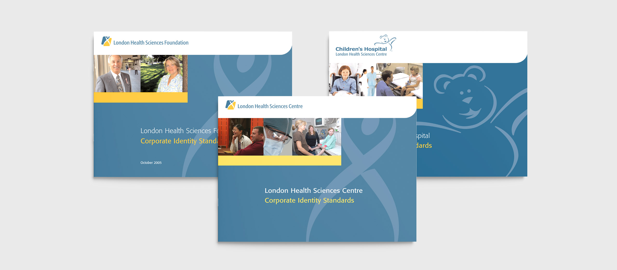
Corporate Identity Standards
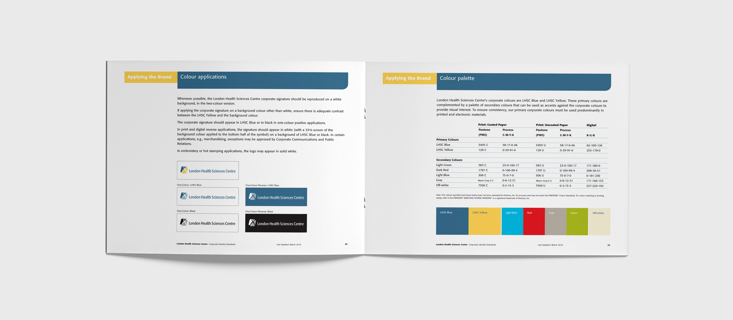
Corporate Identity Standards
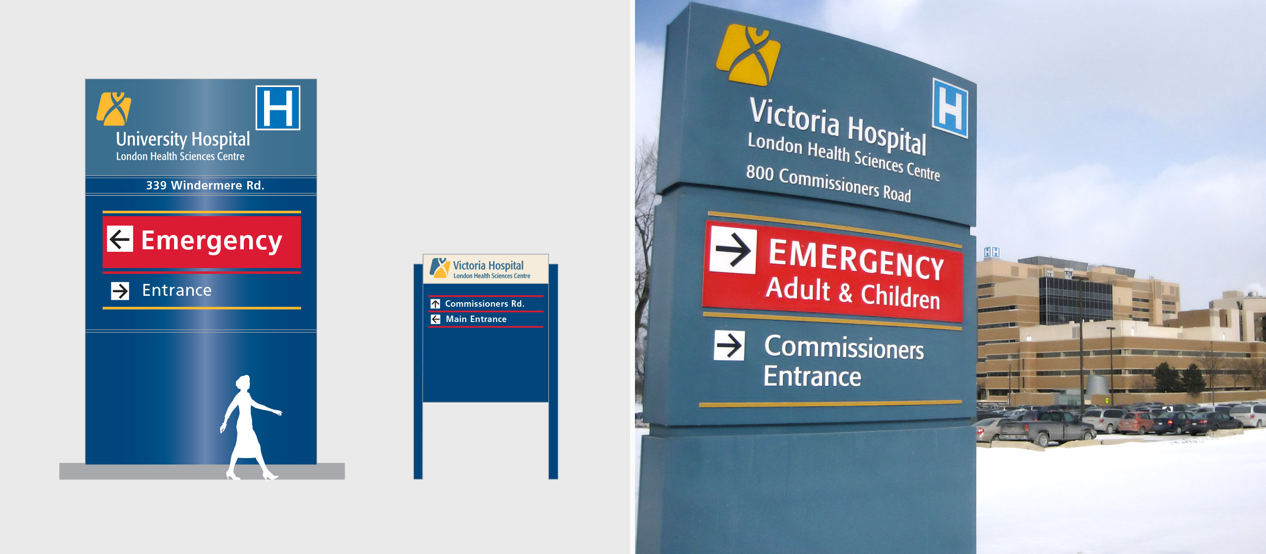
Wayfinding signage

Corporate brochure
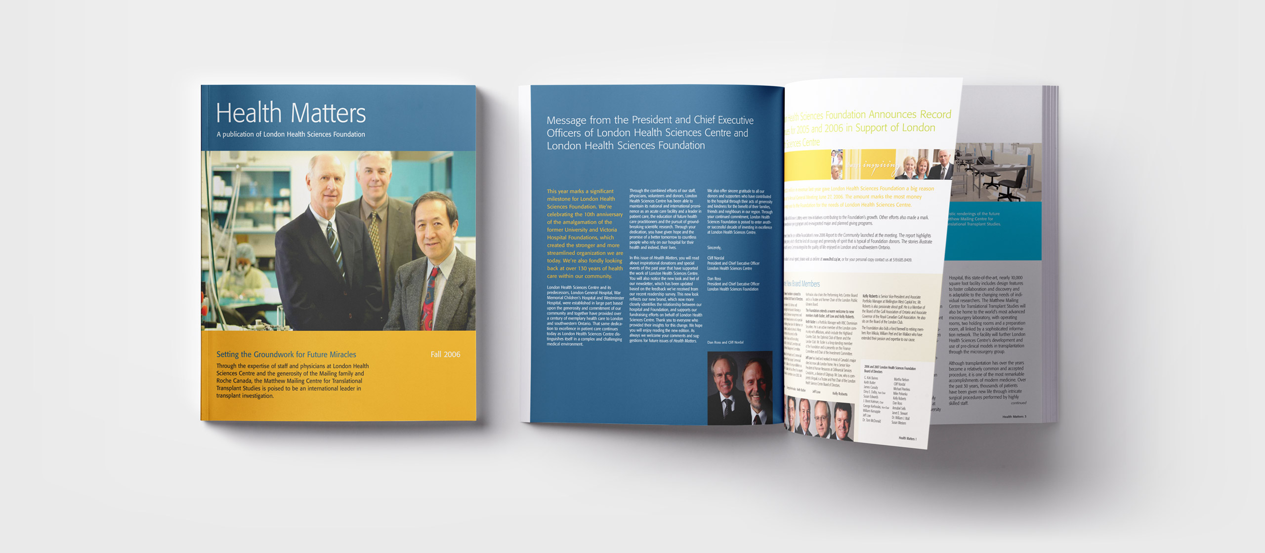
Newsletter
Our contribution
- Brand strategy
- Research methodology
- Brand architecture
- Naming
- Stakeholder engagement
- Brand design and implementation


