How do you reinvent a legacy rewards program for a new reality?
Brand strategy, naming, and visual identity program (logo design and brand system) for Blue Rewards (formerly AIR MILES)
How do you reinvent a legacy rewards program for a new reality?
Brand strategy, naming, and identity design for Blue Rewards (formerly AIR MILES)
THE OPPORTUNITY
With the rising cost of living top of mind for Canadians, BMO saw an opportunity to rethink how everyday spending could deliver more value. Blue Rewards reimagines the AIR MILES model as a more flexible, personalized loyalty experience – designed to help customers make real financial progress.
THE OUTCOME
Building on the multi-partner model popularized by AIR MILES, BMO created a program that enables members to earn points across a broad range of everyday purchases. Powered by new technology, expanded partnerships, and more ways to earn, Blue Rewards launched as a simpler, more rewarding, and more personalized loyalty experience.
Ove established the foundation for Blue Rewards – shaping the brand from the ground up and creating a flexible system designed to scale across channels, support partner integration, and engage Canadians over time.
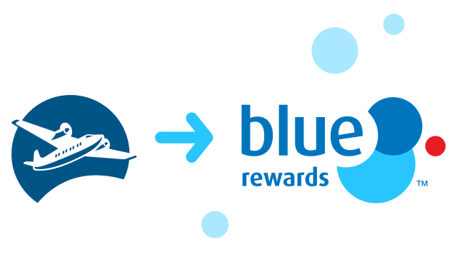
Naming the next generation of rewards
Our first focus was naming. With the positioning still evolving, we explored a range of thematic territories across the program and its associated connection to BMO. As the strategy came into focus, Blue Rewards emerged as the strongest expression – aligning closely with the BMO brand while reinforcing the program’s clarity and simplicity.
Designing something new – and unmistakably BMO
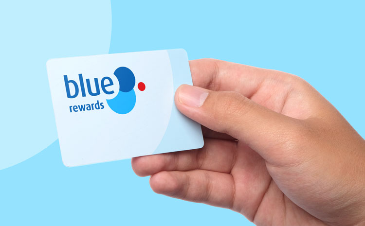
Ove developed a versatile visual system that builds on familiar BMO elements while introducing a more dynamic, expressive layer. The logo draws directly from the bank’s font and colour palette, with the circles and the red dot creating a clear and immediate brand connection.
Adaptations across digital touchpoints – including social avatars, the app icon, and favicon – ensure a consistent presence at every scale.
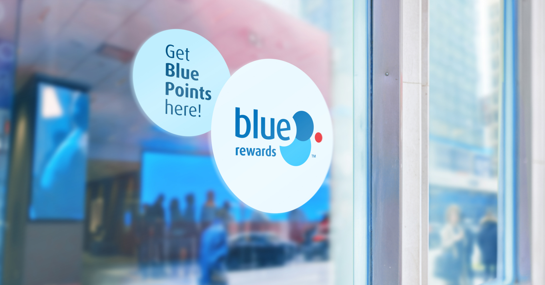
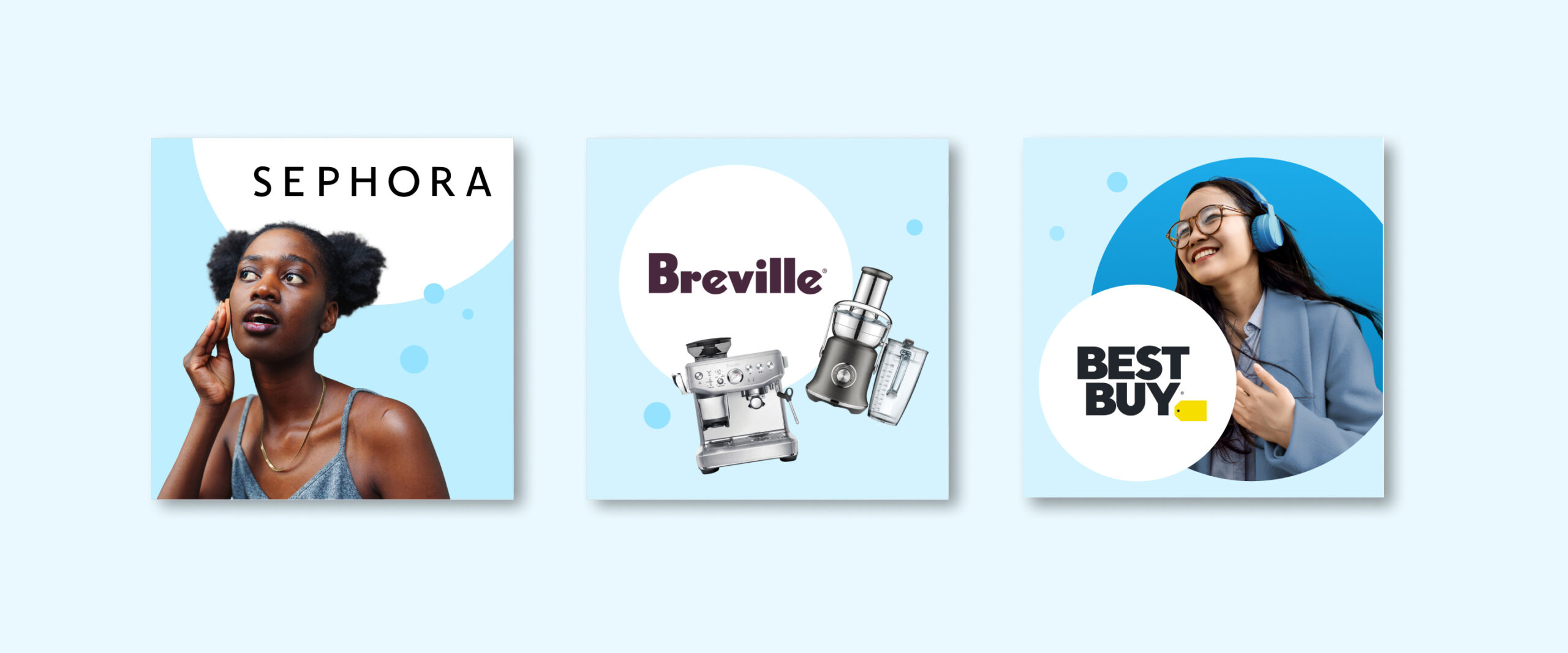
Circles also feature prominently in the execution of the visual style. Placed in groupings to look like bubbles, they create a sense of fun and spontaneity and have a variety of uses – highlighting offers, anchoring illustrations and creating feature space for Partner brands. Photography also helps to define the brand style, capturing human moments with the same joyful tone in candid, true-to-life, and sometimes unexpected ways.

Ove understands both where our brand comes from and where it needs to go. With Blue Rewards, they helped us honour the scale and familiarity of AIR MILES while confidently stepping forward into a more modern, flexible and customer-focused experience.”
Michelle Feeney, Chief Marketing Officer, BMO Canada
An illustration system that comes full circle
Illustration plays a key role in the Blue Rewards visual style, with circle-inspired elements helping to ensure a harmonious look and feel. Two categories of custom illustration – spots and vignettes – support key messages in a subtle way that enables Partner brands to come to the forefront within Blue Rewards-branded environments. Other elements, like rounded buttons and labels, and rounded corners on web panels add to the visual cohesion inspired by the circle.
Guiding the way
To support the transition from AIR MILES to Blue Rewards, Ove created a set of practical tools to help internal teams and partners navigate change with clarity and consistency.
With many features of the program changing, getting a terminology guide out to the internal team was a priority. The process, which began with an inventory of AIR MILES terminology and audit of language used by other rewards programs, led to important questions and decisions impacting the user experience and how it could be simplified. Designed as an easy reference tool, the quick guide features at-a-glance conversion tables for terminology, usage examples for key terms, and basic principles for language to guide future decisions on program terminology.
Social posts 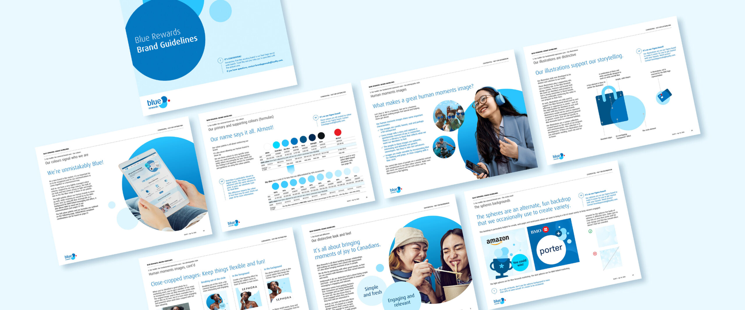
Brand guidelines 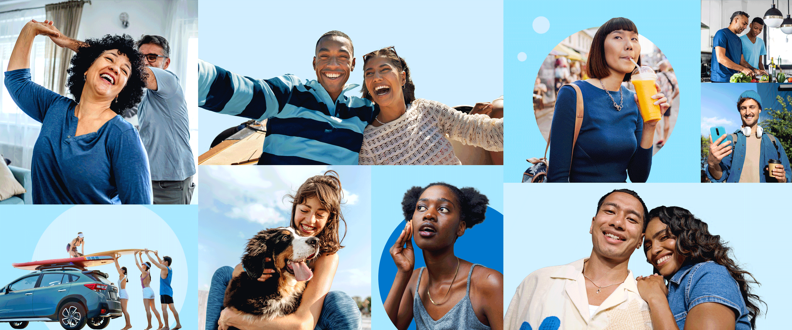
Photography style 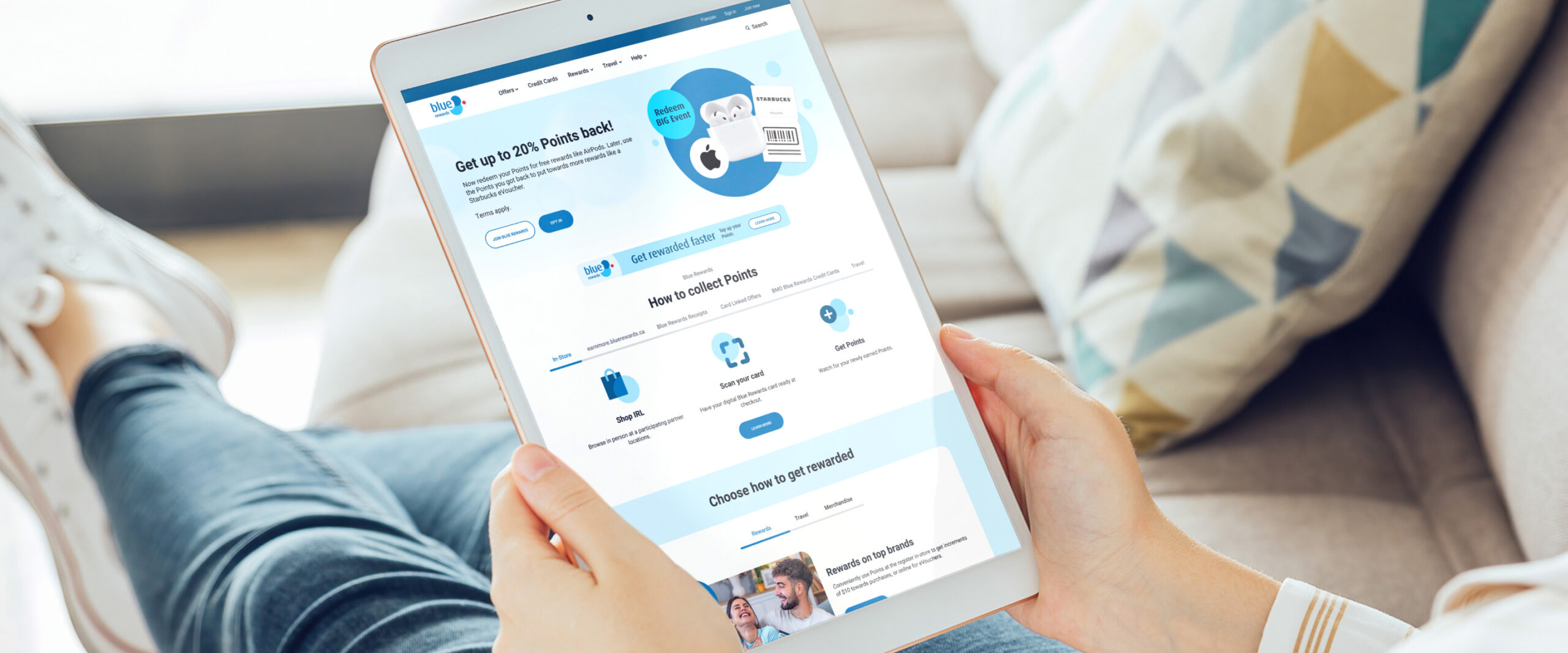
Website 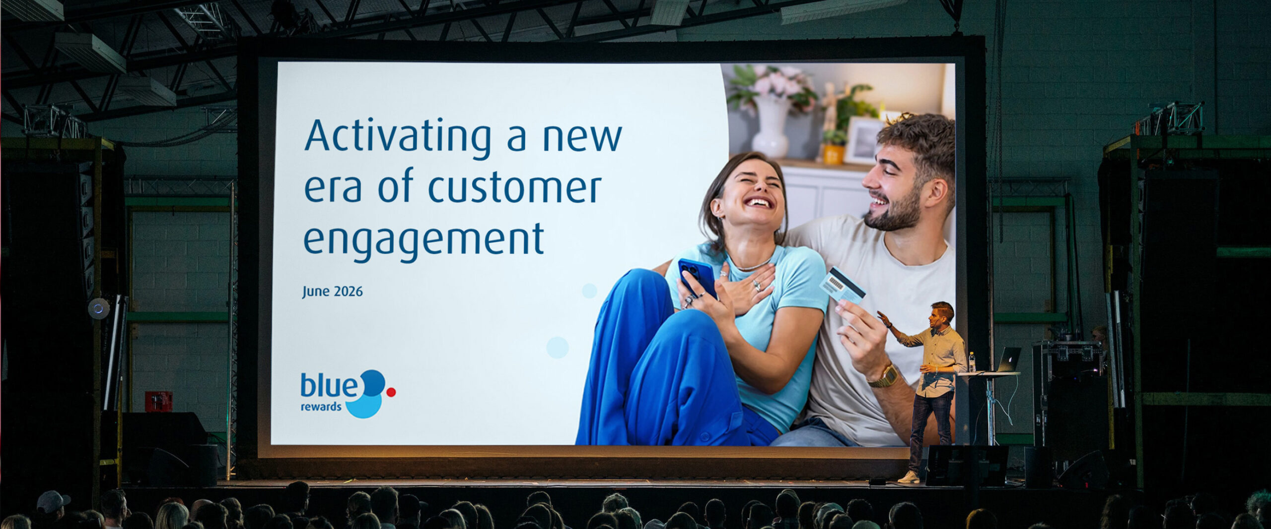
Presentation design intent 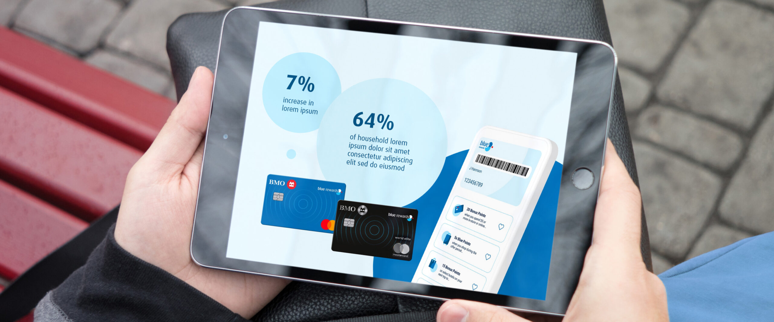
Presentation concept
Equipping teams and partners for rollout
Bringing Blue Rewards to market required more than a visual identity – it called for clear guidance that would help teams and Partners apply the brand with confidence. Ove developed comprehensive guidelines for the new Blue Rewards identity in preparation for the program launch. This was followed with companion guidelines for program Partners. In addition to providing clear instruction on the implementation of the brand visual style, Ove designed the program card and a digital asset library for digital and marketing teams, and defined the brand voice for inclusion in the guide.
Together, these elements were designed to establish Blue Rewards as a next-generation loyalty experience – deeply rooted in the BMO brand and built to evolve with partners and customers over time.
Our contribution
- Industry and comparator research
- Naming and consumer testing
- Visual and verbal brand strategy
- Brand identity design
- Visual expression and design system
- Bespoke illustration library
- Co-branding structures and treatments
- Visual, Partner and terminology guidelines